- Kaleidoscope of Books
- A Historical Tour of Department Stores in Japan
- Chapter 1: Let's Go to a Department Store
- Introduction
- Chapter 1: Let's Go to a Department Store: Where the Fashion is!
- Chapter 2: Shopping at Department Stores: A Place to Discover People and Things
- Chapter 3: See, Eat, and Experience: The Ways that Department Stores Make Shopping Fun
- Afterword/References
- Japanese
1 Let's Go to a Department Store: Where the Fashion is!
- Department stores are known for featuring the latest fashions in elegant displays, and modern Japanese department stores have to be very creative to maintain this image and attract many customers.
Alluring Advertising: Marketing Strategies at Department Stores
- First off, let's take a look at how department stores advertise their wares.
Brand Image: Beautiful Women in the Big City
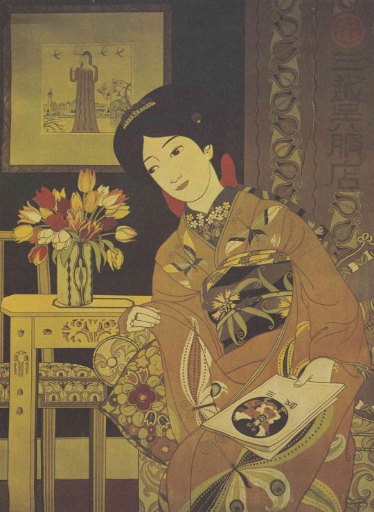
One of the most typical approaches to advertising is the use of bijinga—traditional portraits of beautiful women, through which department stores associate themselves with fashion-conscious ladies. One of the earliest examples of this was a hand-drawn, life-sized poster of a beautiful woman that hung on the wall of a Shimbashi station waiting room near Mitsukoshi in 1899.
This poster was issued to commemorate the completion of Mitsukoshi’s Nihombashi annex building in 1914 and shows a woman with a kimono and furniture that feature sophisticated adoptions of Art Nouveau designs. SUGIURA Hisui, who created this poster, was a pioneer of commercial art and designed numerous posters, brochure covers, and packaging as Mitsukoshi’s director of design.
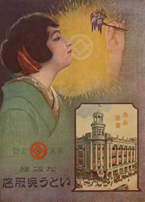
This poster by MACHIDA Ryuyo was awarded the grand prize in an open competition for advertising posters sponsored by Matsuzakaya during 1922.
The model wears a red ribbon in her mimikakushi (hidden ears) hairstyle, which was trendy at the time, and holds an ornamental hairpin adorned with wisteria in her hand. Apparently the judges rated the composition of this poster quite highly, because of the placement of the Matsuzakaya trademark in the subject’s line of sight and its use of coloration that was popular with the public.
Product Brochures
Department stores have always used a variety of media to introduce new products and services, and product brochures are one of the oldest. Department stores began to produce product brochures sometime around 1897 as a means of promoting sales and distributing information about their products.
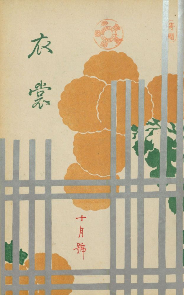
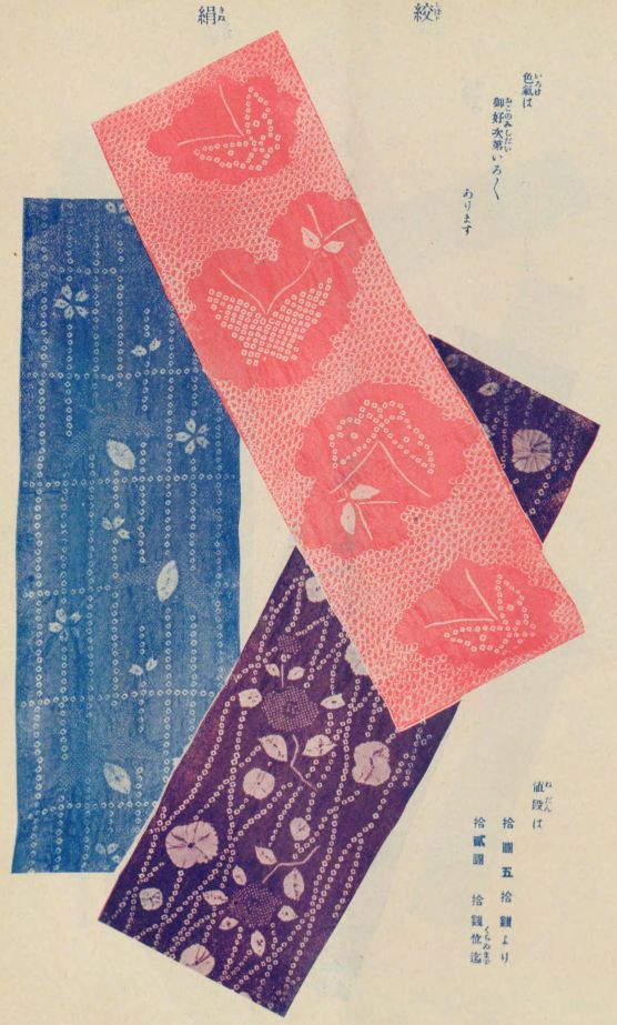
One of Daimaru’s earliest product brochures was published in 1907 and sold for 20 sen (two-tenths of a yen). The cover design (left) by KAMISAKA Sekka was called Chrysanthemums, while the other pages (right) show cloth for kimonos together with their prices. Other pages show clothing trends for men and women as well as an introduction to Daimaru’s mail order service.
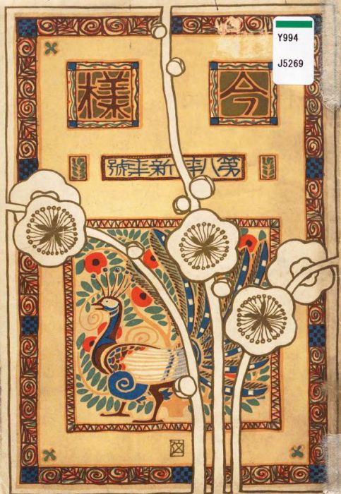
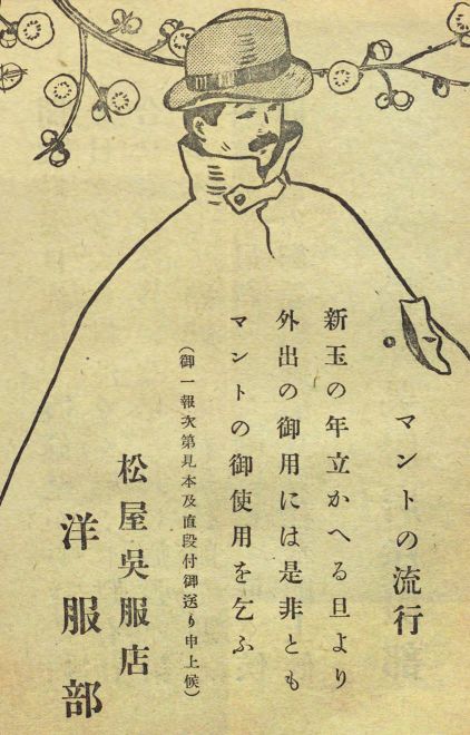
This is the first issue of Matsuya’s Imayo product brochure to be issued in 1913. It features a gorgeous cover (left) of modern design by YAZAWA Gengetsu, called Haru (spring). This issue contains only a few scattered product advertisements (right), and is instead intended to “put aside business to present this issue as pleasure reading for the entire family, with compelling works by leading authorities.” The majority of the content in this issue is literary works, including an essay by KODA Rohan and traditional poetry by SASAKI Nobutsuna.
Reaching More People by Advertising in Newspapers
Newspaper advertisements were another means of conveying information to more people. According to the Koukokunushi-meikan (directory of advertisers) published by the Shimbun-no-shimbun-sha in 1926, department stores generally spent between 50 and 80 percent of their advertising budgets on newspaper advertisements.
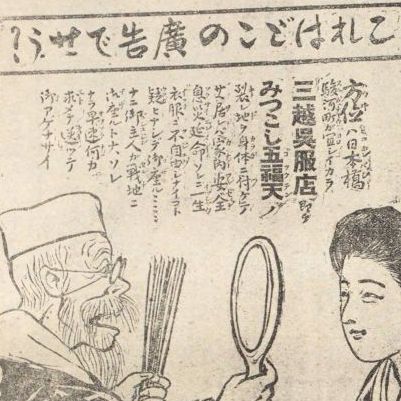
This advertisement was published in April 1905 and depicts a fortune teller advising a woman whose husband has gone to war, saying “Your lucky direction is toward Surugacho Nihombashi, so all you have to do is to wear clothing from the Mitsukoshi Gofukuten to keep your family safe, healthy, and long-lived.” This is a pun on the word gofukuten, which is commonly the Japanese word for “kimono store” but is also the name of a god of happiness. One quirky aspect of this ad is that rather than showing the Mitsukoshi logo, the heading coyly asks “Whose advertisement is this?”
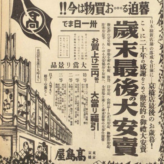
This is the first page of a four-page advertisement (pages 3 to 6) for Takashimaya that was published in the Tokyo Asahi Shimbun on December 24, 1932. The end-of-the-year sale advertised here includes a prize drawing for customers. This is an example of how advertising increased in size at the beginning of the Showa era.
The Impressive Architecture of Department Stores
- Just looking at these advertisements makes you feel like going shopping, doesn’t it? But remember, the buildings themselves are worth a close look, too.
Gorgeous Space
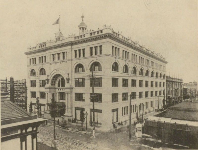
During the Meiji and Taisho eras, the architectural style of department stores changed from a traditional warehouse style to one featuring reinforced-concrete, high-rise buildings as the stores attempted both to convey a luxurious image and to enlarge their retail space. As the stores adopted the Renaissance architectural style so common in Europe and America, they also competed with one another to see who could create the most magnificent commercial space.
This photo shows the white-brick exterior of the Nihombashi Mitsukoshi annex building, which was completed in 1914. This steel-framed, reinforced-concrete structure in a modern Renaissance style comprised five stories above ground and a basement. Newspapers of the time described it as "unequaled east of the Suez Canal" or "the number one store east of the Suez Canal".
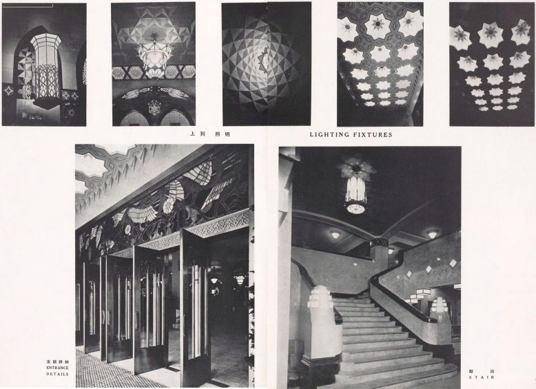
These photos are of the interior and exterior of the Daimaru Shinsaibashi store, which was under construction from 1921 to 1934. A plethora of stained glass and Art Deco ornamentation inside of the building created a magnificent commercial space. This building recently underwent renovation to upgrade an aging structure and reopened in September 2019 with parts of the original interior and exterior preserved.
State-of-the-Art Facilities Contribute to Popularity
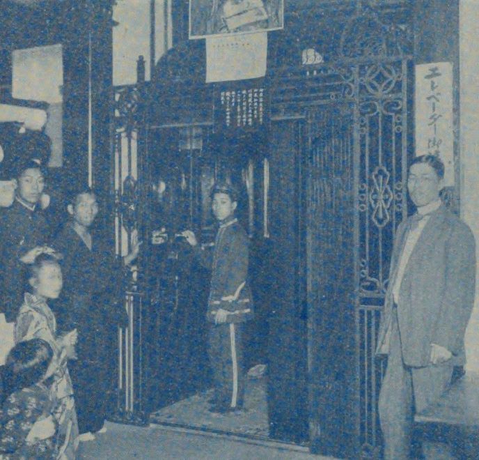
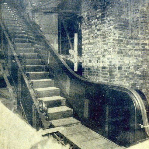
Having the latest, state-of-the-art facilities and equipment were so important to attracting customers that department stores became a kind of tourist attraction. For example, Shirokiya became the first Japanese department store to install an elevator in 1911 and Mitsukoshi became the first to install an escalator in 1914.
This photo whose the elevator installed at Shirokiya as part of an expansion in 1911. The November 1911 issue of the Shirokiya brochure reports in detail on the bargain sale held in celebration of their 250th anniversary and the completion of the expansion on October 1. The description of the elevator says, “We are the first department store to install an elevator for patrons, and it quickly became so popular that the operators were too busy to break for lunch.”
This photo shows the escalator in Nihombashi Mitsukoshi annex building prior to completion of construction in October 1914. A Mitsukoshi brochure called it “the first practical use of an escalator in a building in Asia” and introduced its features, mechanisms, and safety in a five-page spread. Although visitors to an escalator exhibited in the Tokyo Taisho Exposition at around the same time had to pay a fee, customers could ride the Mitsukoshi escalator for free.
Column: Showroom Window Displays Attract Customers
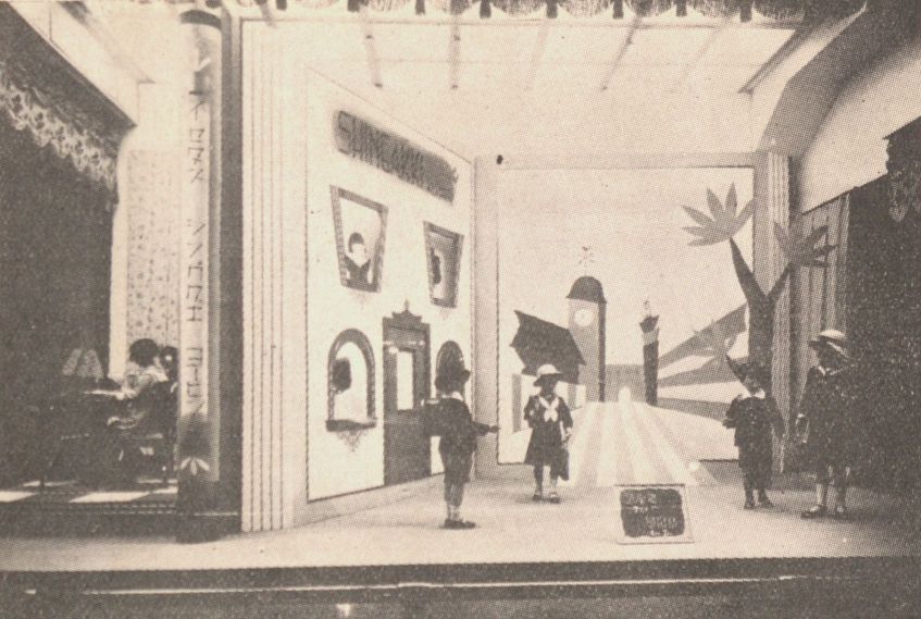
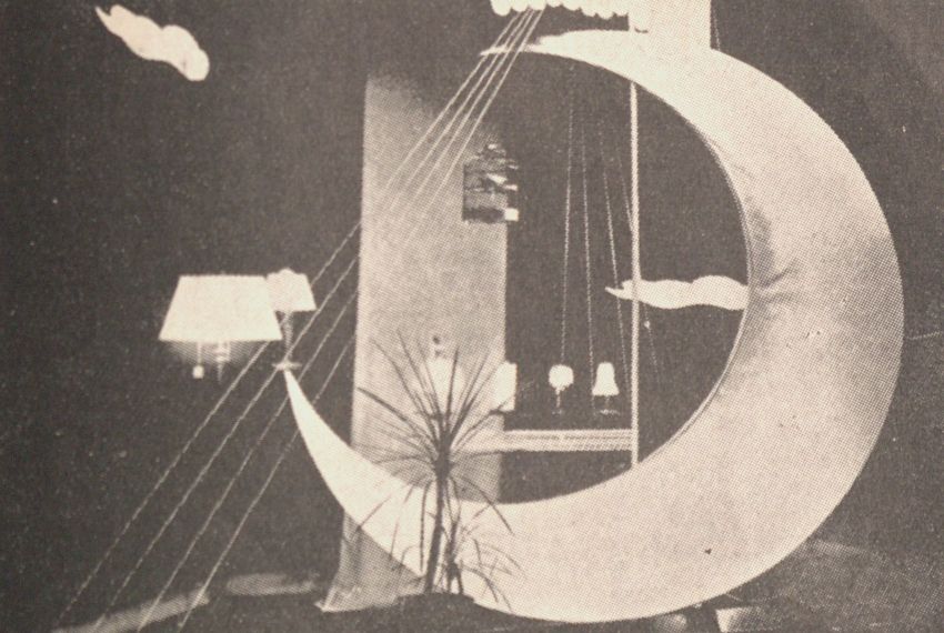
Window displays have always attracted customers, to the point that looking without buying came to be known as “window shopping.” Window displays first became a common mode of advertising in Japan in the middle of the Meiji era. After Takashimaya set up its first display windows during an expansion of their Kyoto store in 1896, many other department stores installed them during renovations or the construction of new stores.
One of the highlights of this directory of famous suppliers is its evaluation of display windows for their visual artistry, which it likens to “shining quietly while dressed in infinite beauty” and “a longing that cannot be ignored by anyone who lives in a modern city.” It goes on to list the “100 best department store display windows,” which includes a Shinjuku Isetan display of school uniforms that was presented in spring at the start of a new school year and a Nihombashi Shirokiya display of electric lights that appeared in autumn as the nights were becoming longer. It would seem that the basic structure of window displays remains unchanged to this day and that the idea was to take good advantage of three-dimensional space in creatively laying out merchandise. As the seasons changed, so did the window displays, which informed passers-by of latest fashions and the changing urban landscape.
- Window shopping certainly makes you want to start spending money, so let’s take a look inside these department stores.
Next Chapter 2:
Shopping at Department Stores


