Glossary
This glossary explains the following terms.
Blind Printing (Blinddruck)
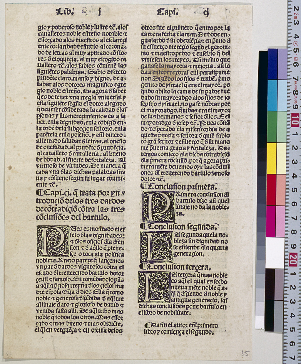
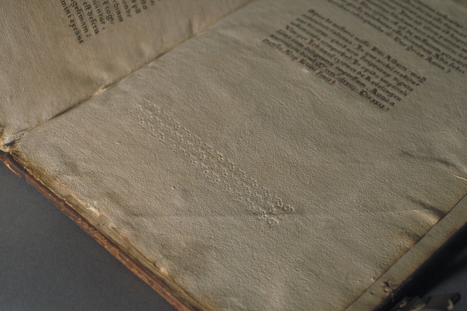
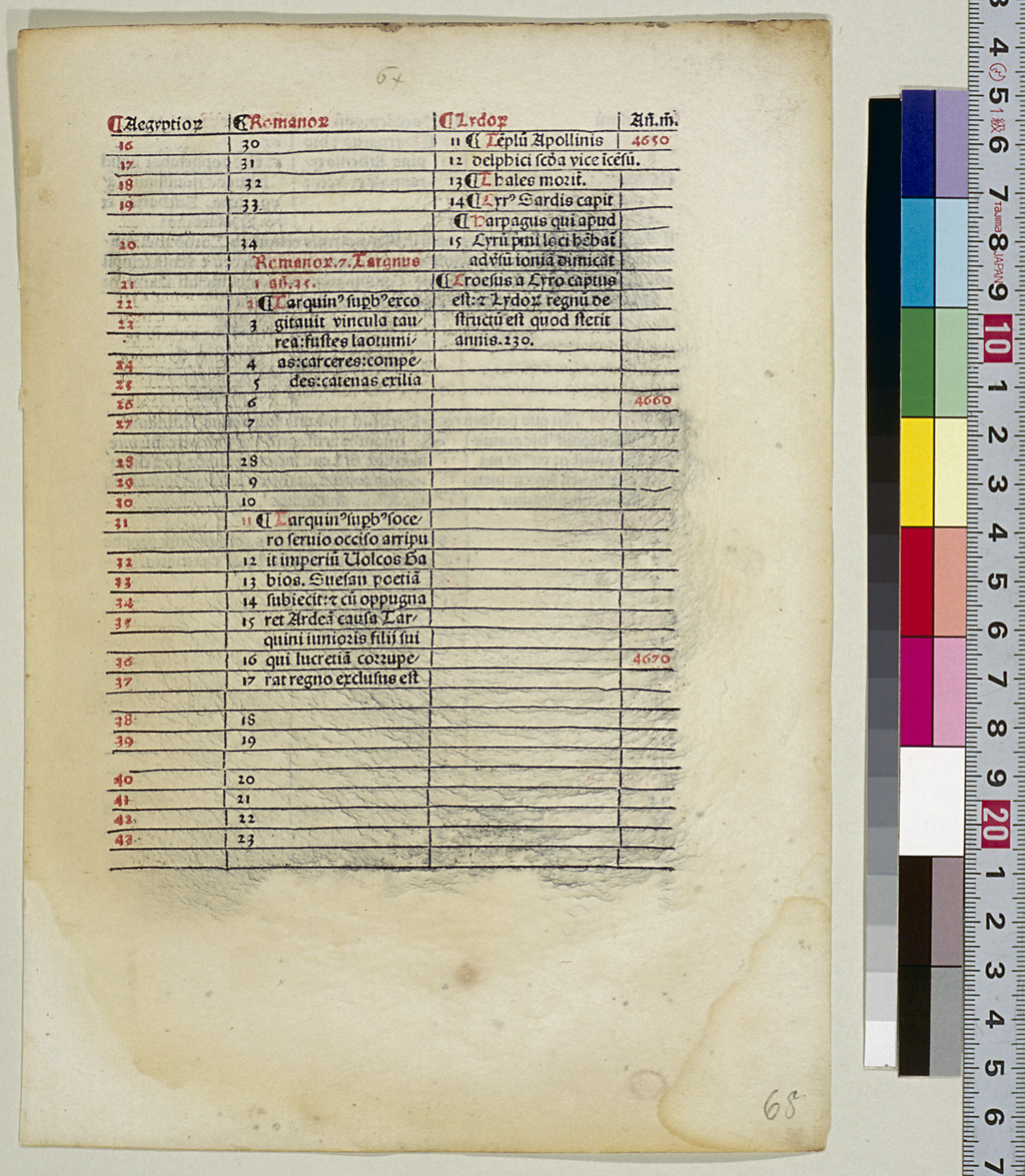
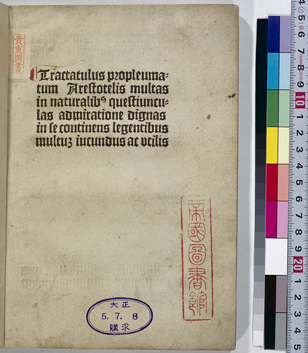
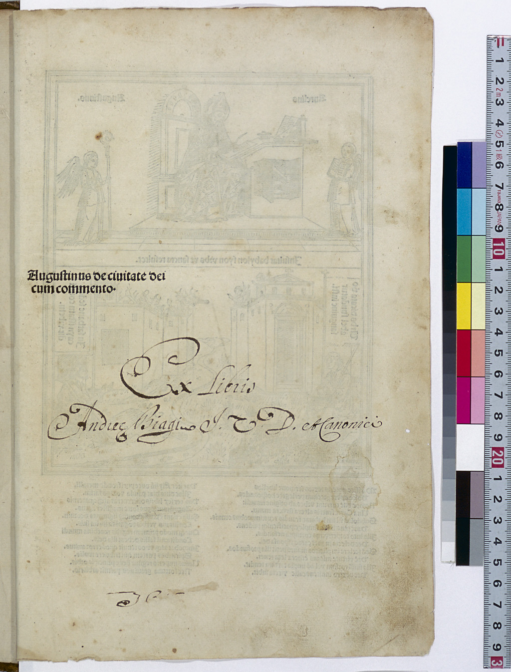
In some incunabula, there are portions of pages with no ink applied even though types were set for the pages, and only the traces of the types pressed are visible. A study on incunabula claims that this blind printing is found in at least 200 titles of incunabula. When a large portion of a page was to be left unprinted, the types were probably set for the blank portion as well in order to stabilize the printing paper on the forme.
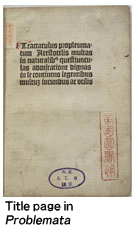
One example of blind printing is found in the lower part of the title page of Aristotle's Problemata (Leipzig: C. Kachelofen, 1494), which is included in the Incunabula Collection of this exhibition.
Block Book (Blockbuch)
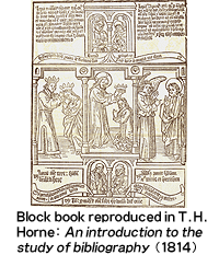
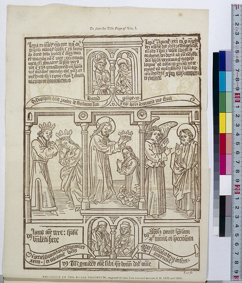
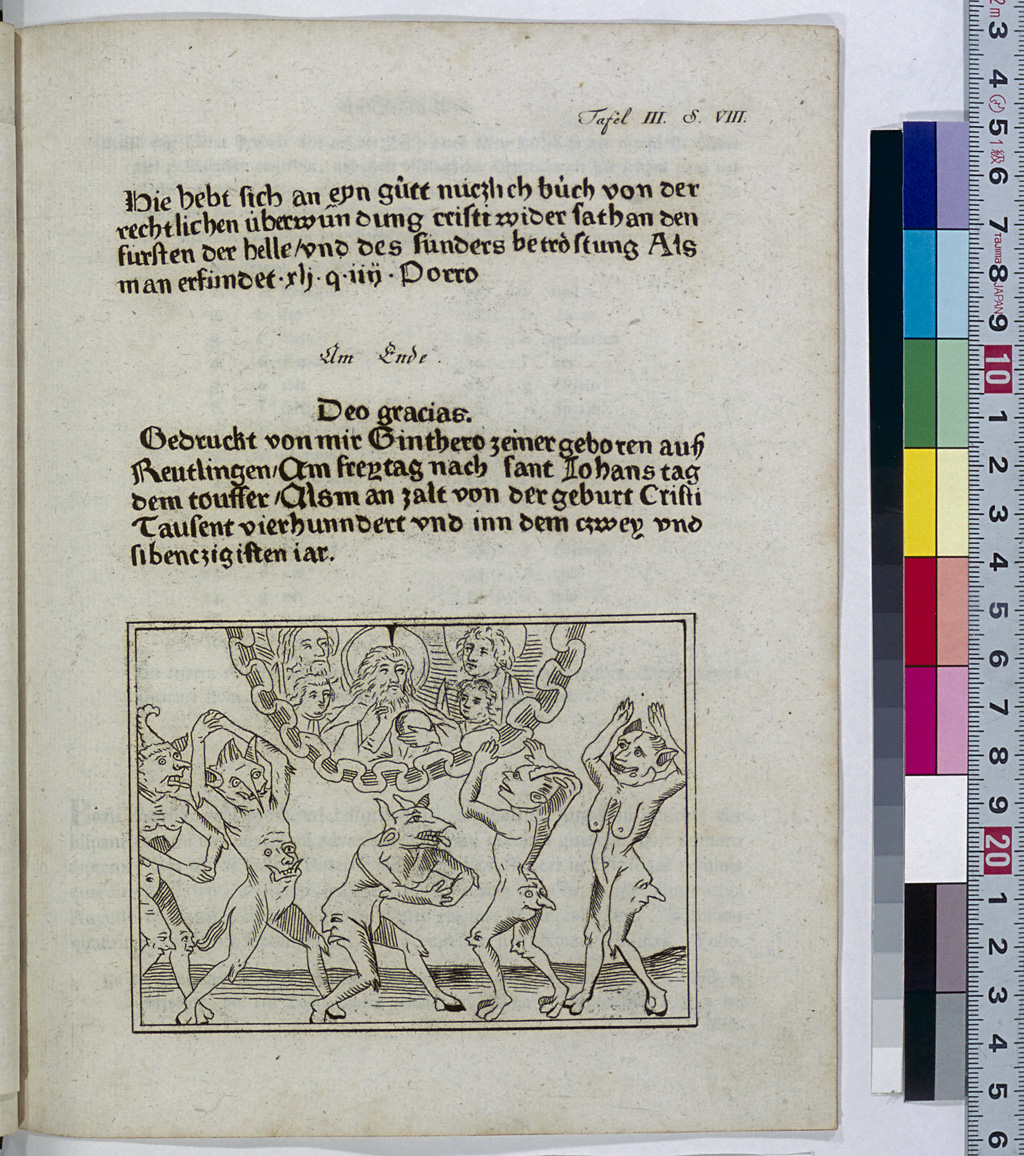
In Europe, wood block printing was being practiced by the 14th century at the latest. It has been said, however, that the wood block print known as the oldest is the "Virgin and Child with Four Saints" that was printed in 1418. Since many woodprints printed around the same era, including the one mentioned above, were religious paintings designed for the common people, and only a small number of them are still in existence, the details of their printers and other related matters are not known. From these woodprints emerged printed broadsides that contained not only pictures but also text, and eventually, people started to bind several broadsides together to make a booklet. These booklets are called "block books" or "xylographs," which are distinguished from incunabula. The block books that were most frequently printed include Biblia pauperum, Speculum humanae salvationis, Apocalypse and Ars moriendi, which were also printed as incunabula. Block books were not necessarily old, and many of them were printed during the period 1465-1475. One of the distinctive features of block books is that only one side of the paper was printed, but in some cases, the blank backs were pasted together to make a book without blank pages.
Border Decoration (Umrahmung)
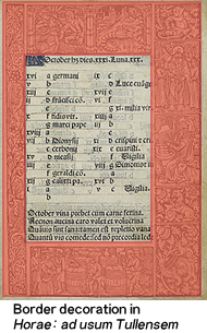
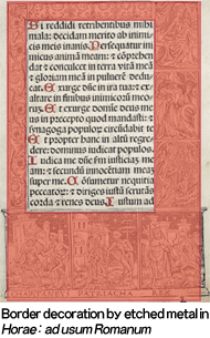
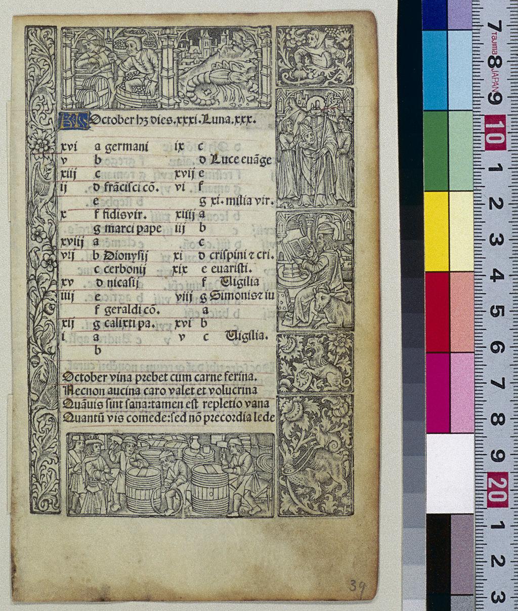
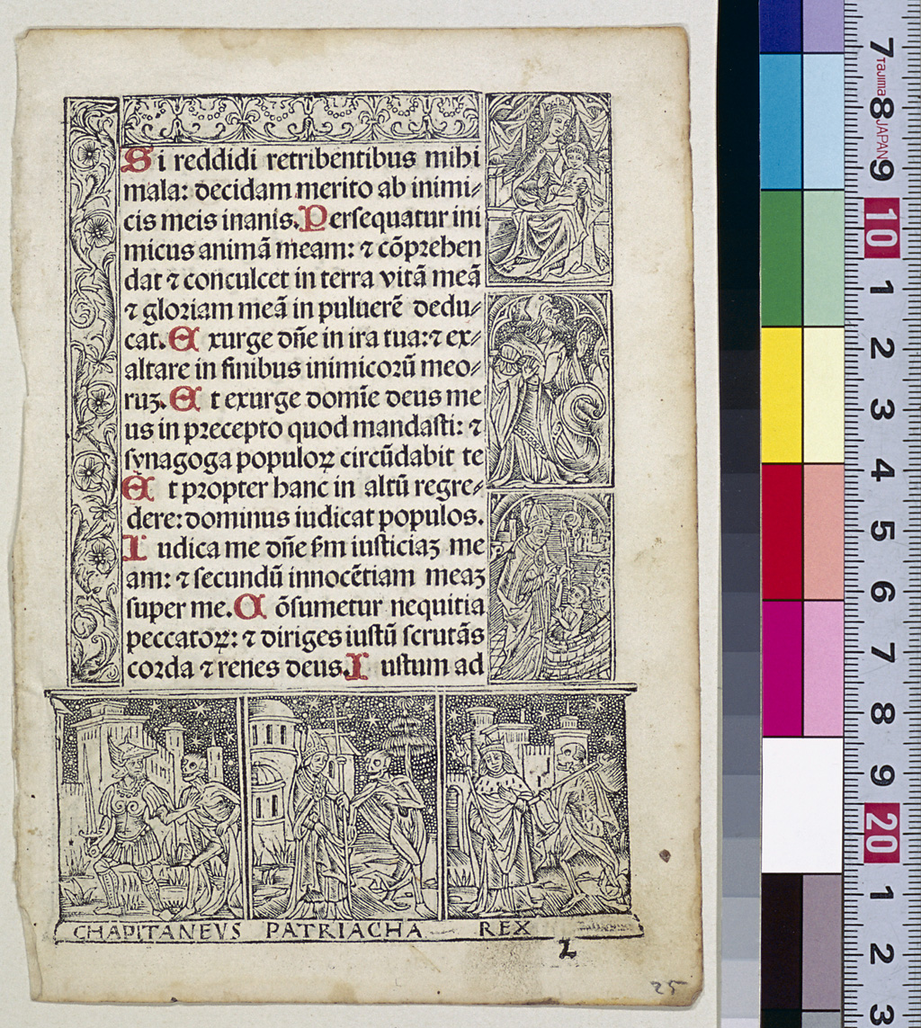
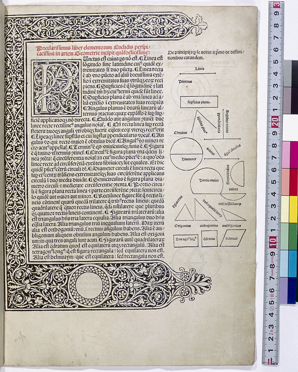
Taking over the same book design as the manuscripts, border decoration was done on the first leaf of a book or chapter and each page of a Book of Hours for incunabula as well. For border decoration, woodcuts had superseded the hand illuminations, and were often employed by the printers who excelled in woodcut illustrations. Books of Hours, known to have been printed in Paris in large quantities, were designed with border decorations which surrounded the edges of pages with pictures of Biblical scenes. The border decorations in some of these books were printed using not woodcuts but etched metal.
Broadside (Einblattdrucke)
A broadside (broadsheet) is a sheet of paper printed on one side only. Almanacs, indulgences, advertisements, bulls (proclamations) and so on were printed in the form of broadsides. Gutenberg and Fust, as well as Caxton, printed indulgences. Broadsides carrying advertisements of printed books or type specimens were also produced. A catalog of broadside incunabula was published under the title Einblattdrucke des XV. Jahrhunderts, in 1914, slightly earlier than the comprehensive union catalog of incunabula GW (1925-).
Chain line and Wire line
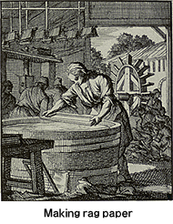
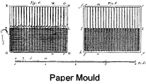
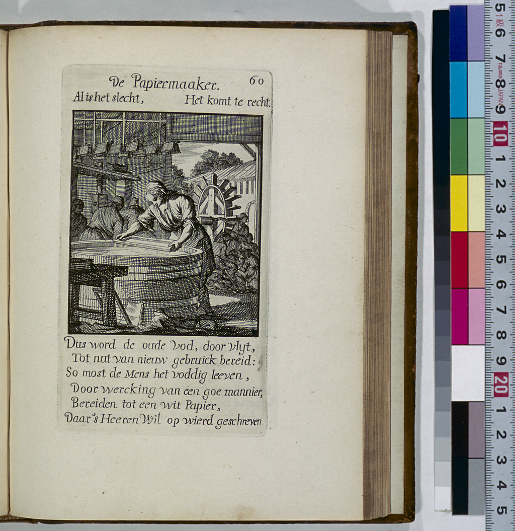
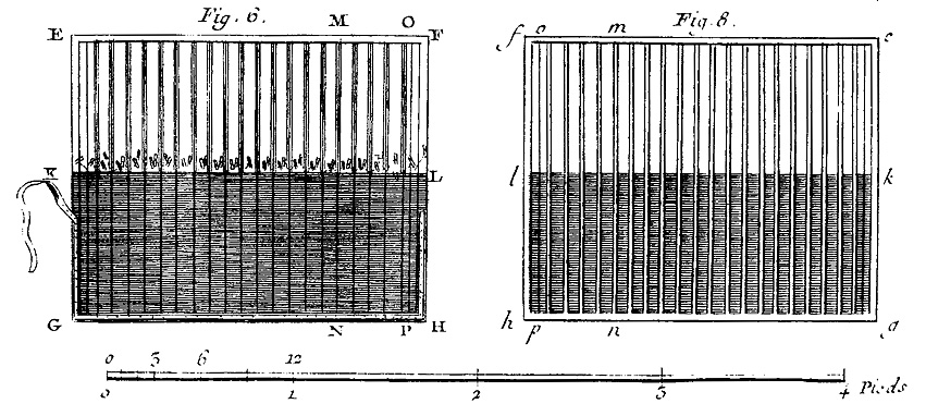
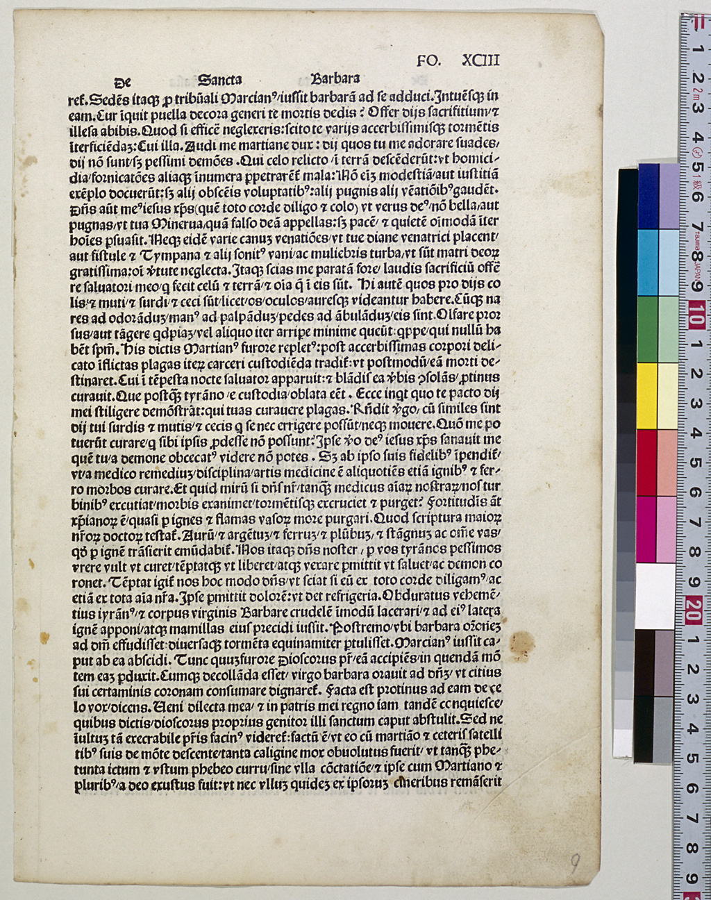
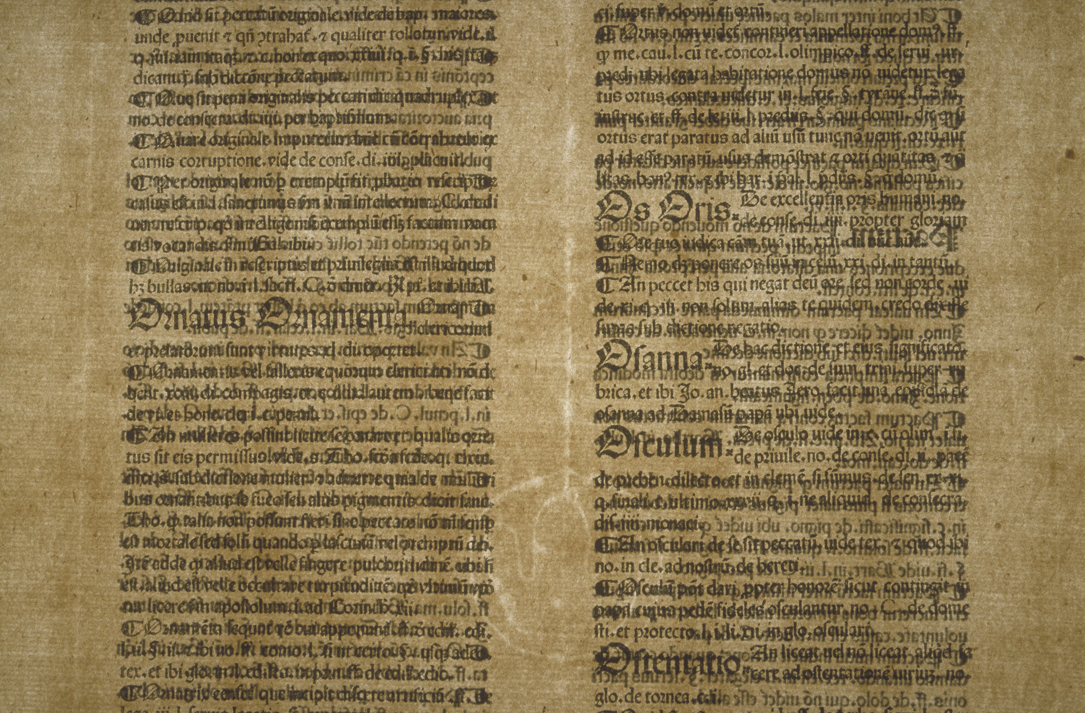
During the incunabula period, Europeans used rags to make paper by the following method: the rags were cut into small pieces; fermented; ground by watermill; and scooped into a mould to dry. Therefore handmade paper does not have a uniform thickness; it varies in thickness according to the mesh of the mould. If held against the light, the thinner part of handmade paper appears brighter, and it is possible to detect thick lines spaced several centimeters apart, as well as thin lines closely spaced crossing the thick lines at a right angle. The thick lines are referred to as the "chain line" and the thin lines the "wire line."
Chain lines are visible lengthways in a whole sheet of paper. If the paper is folded, the direction of chain lines and wire lines varies as shown in the following table:
| Whole sheet of paper | Folio | Quarto | Octavo | Sext-Decimo | |
|---|---|---|---|---|---|
| Chain lines | Lengthwise | Lengthwise | Crosswise | Lengthwise | Crosswise |
| Wire lines | Crosswise | Crosswise | Lengthwise | Crosswise | Lengthwise |
Colophon (Kolophon)
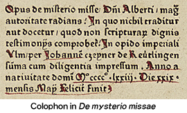
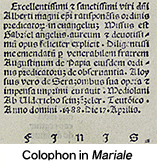
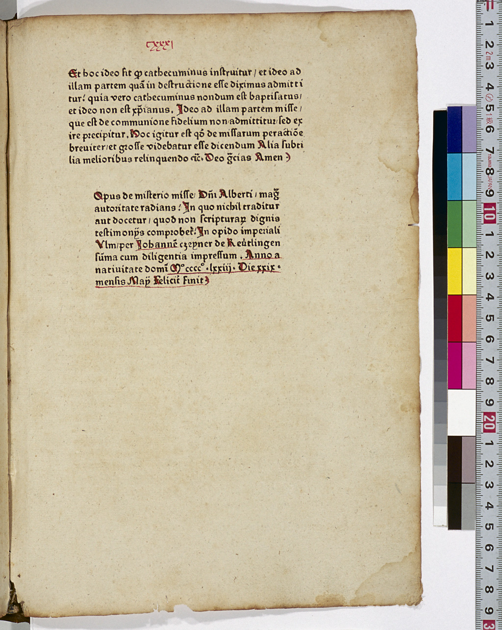
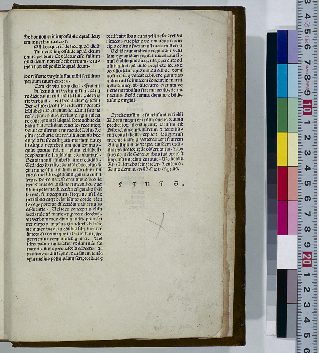
Like medieval manuscripts, early incunabula did not have title pages. The high cost of animal skin used as the medium did not allow the waste of any part of the material for other than the text. Instead, the title, author's name, transcriber's name, place and year of transcription and other related matters were written at the end of the manuscripts. Similarly, for the incunabula which took their place, the title, author's name, printer's name, place and year of printing and other matters were printed at the end of the incunabulum, and this portion of an incunabulum is called the "colophon" (meaning "the finishing stroke").
Color Printing (Mehrfarbendruck)
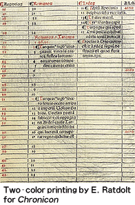
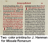
In the medieval period, not only black ink but also blue or red ink was used for manuscripts. To reproducing these colors, Gutenberg tried printing the 42-line Bible using red ink, but this was not successful, and he finished the work by handwriting the parts that had been originally planned to be printed in red. In 1457, Fust and Schöffer printed the initials in color in Psalterium (Mainz Psalter), but color printing did not spread widely in subsequent years, presumably due to technical difficulties. The early 1480s, however, saw printers such as E. Ratdolt of Augsburg who excelled in printing parts of books in red ink.
During the incunabula period and for a long time thereafter, illustrations were hand colored. In the 17th and 18th centuries, color printing began with mezzotint, aquatint and other types of intaglio printing. When Sir Isaac Newton put forward his theory of the three primary colors of light in the late 17th century, J.C. Le Blon utilized this theory for color printing. In the 19th century, lithography was invented, prompting the development of a coloring technique called "chromolithography." Today, offset printing is widely used for color printing.
Column (Kolumne)
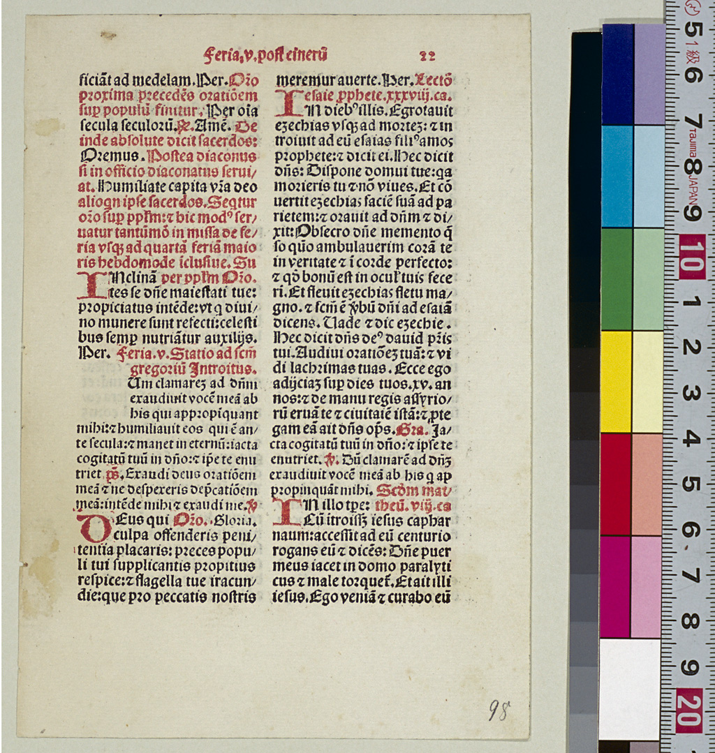
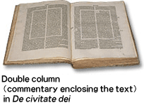
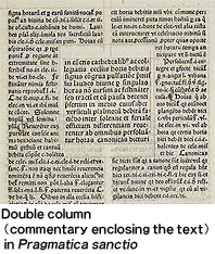
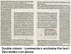
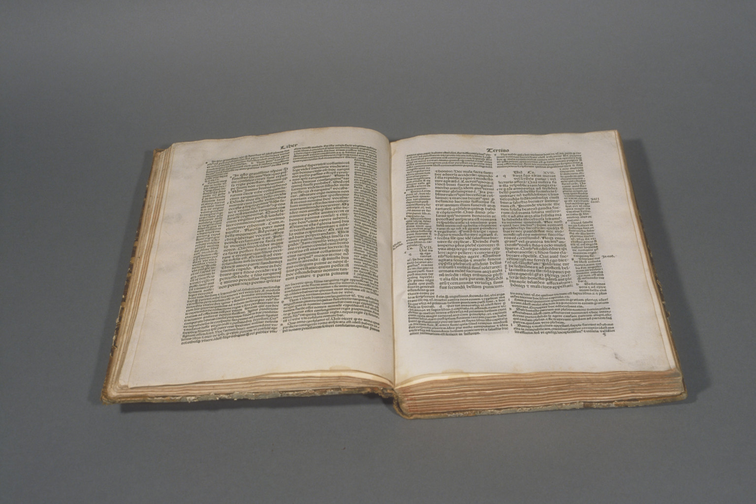
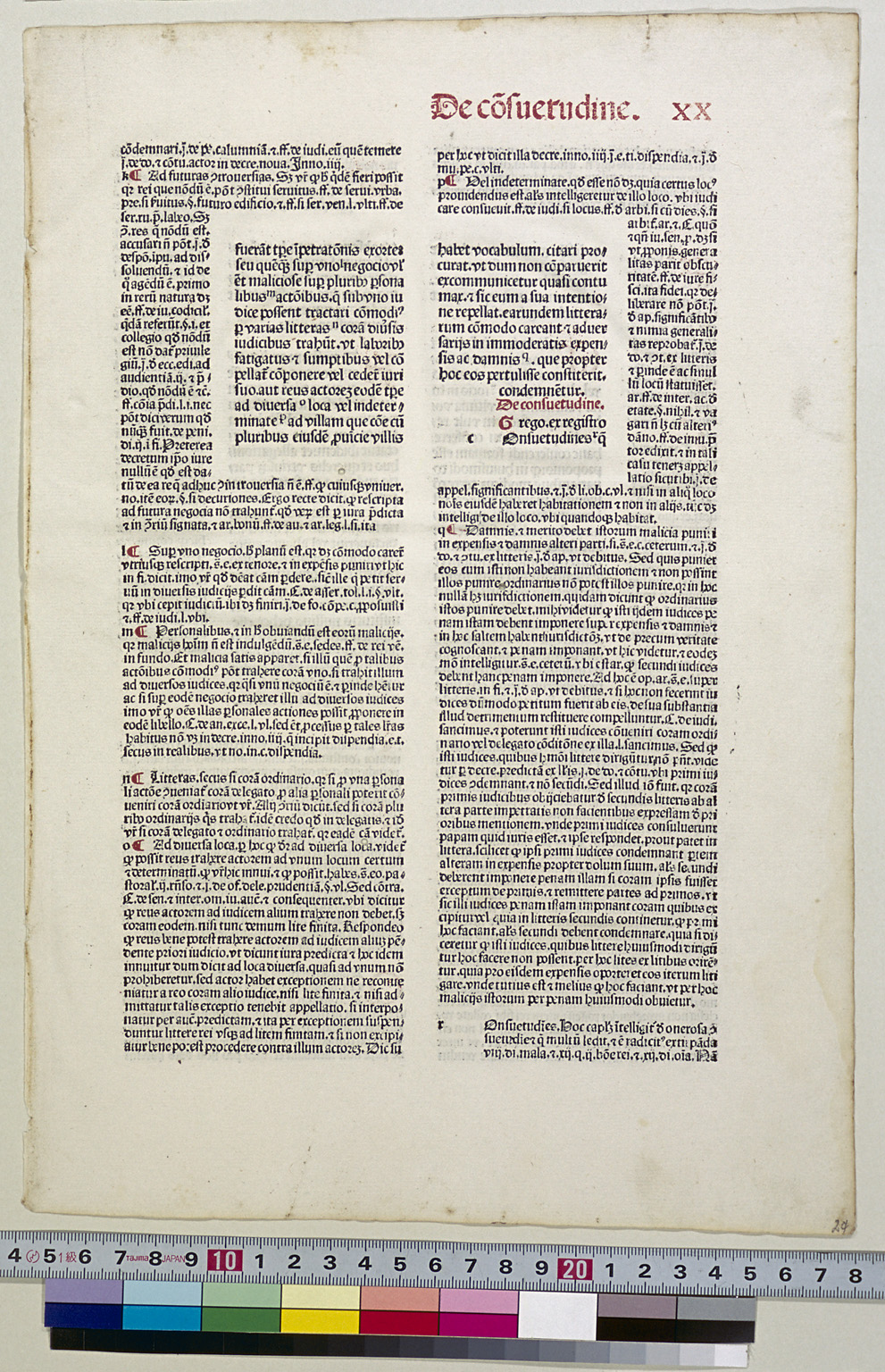
When production first began on codices around the end of 4th century, each page usually had a three-column layout. In the 9th century and thereafter, the double-column layout became popular, and it was often used for printing incunabula, including the 42-line Bible. In medieval manuscripts concerning laws, explanatory notes were positioned around the text of the laws. In the same way, the type was set so that notes were arranged to surround the text in incunabula.
Contractions and Abbreviations
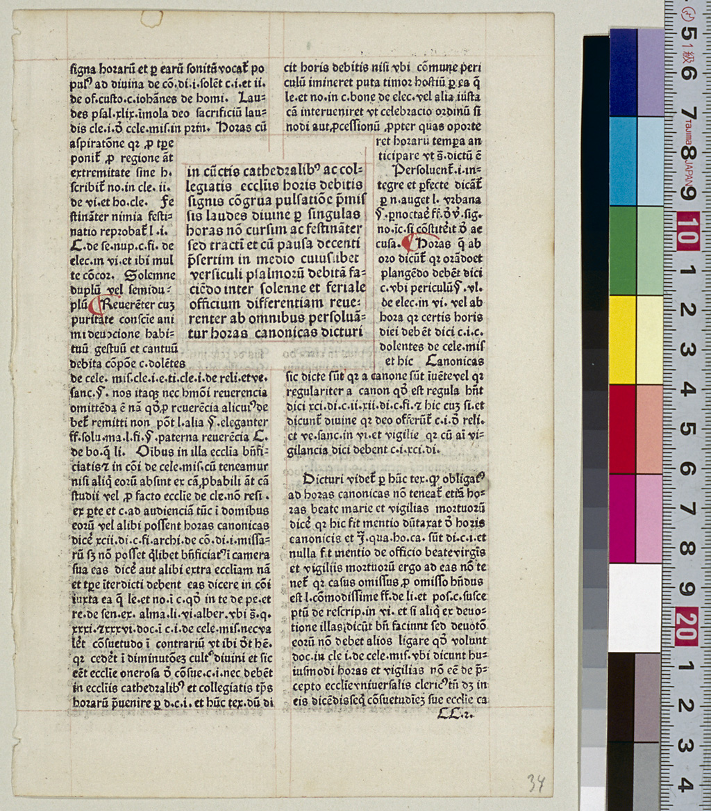
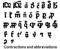
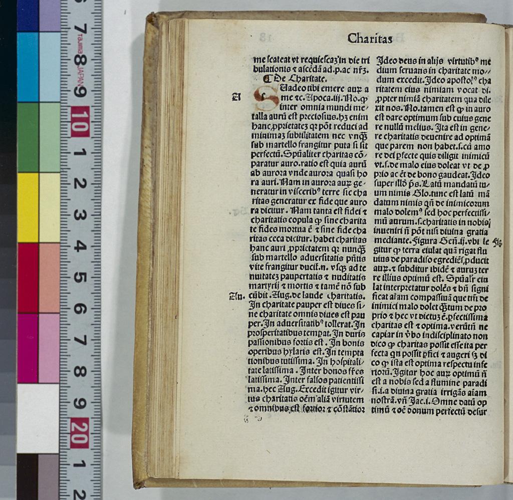
In medieval manuscripts, the spelling of nouns and verbs was often shortened to save transcription space and work. To avoid confusion and ensure proper identification, symbols such as "-," "~," "o" were added above or within some alphabetical letters in shortened words. Numerous methods were used for shortening the spelling of words including: (1) retaining the beginning of a word and omitting the rest (truncation); (2) omitting the middle of a word (contraction); (3) adding "-," "~" or "o" to indicate the omitted letters and their positions; (4) omitting the ending of a word and adding a symbol; and (5) replacing the entire word with a symbol. There is such a variety of methods that J.L. Walther, an 18th-century paleographer, compiled a dictionary of abbreviations. A. Chassant, A. Cappelli, A. Pelzer and other scholars have also gathered various examples of abbreviations and compiled dictionaries.
Printers of incunabula strove to reproduce medieval manuscripts as they were, and therefore, contractions and abbreviations were also printed as they were. For this reason, types of letters with symbols as well as types for non-alphabetical letters were created. The figure on the left-hand side shows the example types used for contractions and abbreviations from a set of the types used by C. Kachelofen, called "Typ. 3."
The following section shows some examples of contractions and abbreviations.
 is an abbreviation of "Quia," and
  is an abbreviation of "Quare."
- Usually the vowels with a line attached above such as
 ,
,  ,
,  ,
,  , and
, and  means that "m" or "n" is omitted after the vowel. For example,
  represents "amen" and
  "cum."
 - Also the following six consonants,
 ,
,  ,
,  ,
,  ,
,  , and
, and  with a line attached above indicate that some letters before and/or after the consonant are abbreviated. For example,
  represents "augusti,"
  "beatum,"
  "domini" and
  "tempus." Particularly,
  often represents "pr(a)e,"
  "quae" and
  "re." For example,
  represents "prete,"
  "quaedam" and
  "res."
  is an abbreviation of "ergo," but there is also the use of
  to represent "grossos."
 is an abbreviation of "quo," and
  represents "quod."
 is an abbreviation of "dicit," but there is also the use of
  to represent "divinae."
 is an abbreviation of "hic," but it is also used so that
  represents "habet" and
  "philosophiae."
 is used as in
  to represent "talis," and used as in
  to represent "legitur."
 is an abbreviation of "tre," and
  represents "tres." When
  is placed at the end of a word, it becomes an abbreviation of "-ter."
 is an abbreviation of "ter," and
  represents "terre."
 is an abbreviation of "ut."
 is an abbreviation of "per" or "par."
  represents "pare" and
  "parumper."
 is an abbreviation of "pro."
  represents "probat" and
  "probem."
 is an abbreviation of "papa," but it is also used to represent "populo" as in
  .
. is an abbreviation of "propter," but it is also used to represent "prope" as in
  and "propheta" as in
  .
. is an abbreviation of "qui" or "quod." For example,
  represents "quoddam."
 is an abbreviation of "quam," and
  represents "quamvis."
 is an abbreviation of "que" and is used at the end of a word. For example,
  represents "quodcumque."
 is an abbreviation of "quoque."
 is an abbreviation of "et."
 is added to the end of a word to indicate that "rum" is omitted.
 is used as an abbreviation of "com" or "con" when it is placed at the beginning of a word, and as an abbreviation of "us" or "is" at the end of a word.
 is used as an abbreviation of "us" or "um" when it is placed at the end of a word.
Shown above are some examples of contractions and abbreviations chosen from a set of the type fount used by C. Kachelofen named "Typ.3." There are other forms of contractions and abbreviations also used in incunabula. For more information, see A. Cappelli's Lexicon abbreviaturarum; dizionario di abbreviature latine ed italiana (1929; 6th ed. 1990).
Aristotle's Problemata, presented in the section "Incunabula Collection," reads as follows, if the abbreviations are filled in:
![]() Incipiunt Propleumata Arestotelis.
Incipiunt Propleumata Arestotelis.
[O]Mnes hominess naturaliter scire desiderant scribit
Arestoteles princes philozophorum primo methaphisice cuius causa potestas redidi talis Quia omne ens na turaliter appetit summa perfectionen et similiter conatur se associare primo enti diuino et immortali inquantum potest. ut quia scientia est de perfectione intellectus humani. ergo omnes hominess naturaliter scire desiderant. Rursus et alia ratio est. Nostra quodcumque ens naturaliter appettit bonum vt se conseruare potestas in rerum natura. sed quia omnis noticia scientifica est de numero bonorum honorabilium vt patet primo de anima. ergo naturaliter omnis homo scire desiderat Et ex consequenti omnis scientia inquantum intellectui humano est possibilis est adquirenda. Quamuis igitur quelibet scientia sit perserutanda magis tamen illaque est nobilior et communior alijs scientijs. sed quia philozophia naturalis confert maximas delectations vt patet. quarto Ethicorum. ergo preceteris scientia philozophica diligencius est inquirenda Etiam propter alias causas Nam presens scientia est filiaris scientie naturali quir ipsa clarificat animan ipsa facit delectari in hoc seculo. vt dicit Arestoteles in libro de pomo et morte qui etiam intantum clarificat hominen vt ipsum primo enti diuino et immortali assimilari laborat. teste seneca in epistola in talia prorumpens verba Hoc mihi philozophia promittit vt sumopere me deo parem reddit Libet igitur de animalibus corporalibus presertim de corpore humano ex pluribus artificialibus codicibus propleumata colligere Et est primum tale.
![]() Queritur quare inter omnia animalia homo habet faciem versus celsum eleuatam Respondetur multipliciter. Primo Quidam est ex voluntate ipsius creatoris et quamuis illa responsio sit vera non tamen videtur valida in propositio. quia sic facile est omnia soluere Secundo respondetur quod omnis artifex opus suum primum facit deterius. et post hoc opus suum secundum melius et sic deus creauit bruta animalia primo. quibus dedit faciez de pressam ad terram inclinatum. Et secundo Aij
Queritur quare inter omnia animalia homo habet faciem versus celsum eleuatam Respondetur multipliciter. Primo Quidam est ex voluntate ipsius creatoris et quamuis illa responsio sit vera non tamen videtur valida in propositio. quia sic facile est omnia soluere Secundo respondetur quod omnis artifex opus suum primum facit deterius. et post hoc opus suum secundum melius et sic deus creauit bruta animalia primo. quibus dedit faciez de pressam ad terram inclinatum. Et secundo Aij
Costeriana
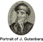
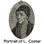
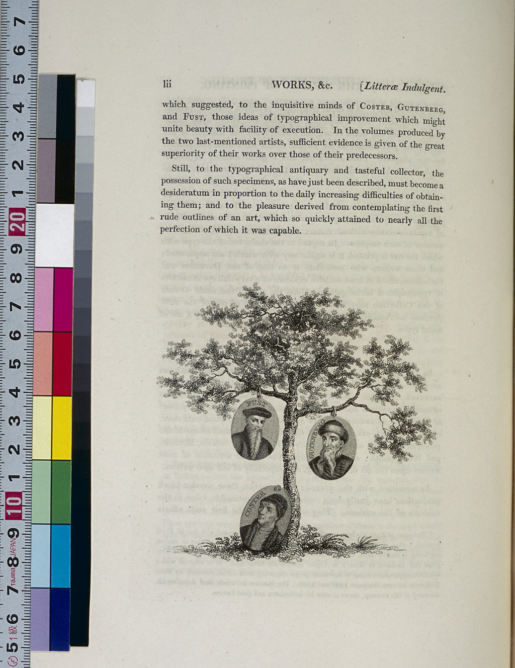
The controversy over who invented the art of printing has been around for hundreds of years. Today, the invention is attributed to Johann Gutenberg (c.1400-1468), but at one time, the prevailing view was that the true inventor of printing was Laurens J. Coster (c.1370-1440) of the Netherlands. Kölnische Chronik (The Cologne Chronicle), published in 1499, states that this prototype was invented in the Netherlands and that Donatus's Ars minor was printed there much earlier than in Mainz. H.Junius's Batavia, published in 1588, states that "Laurens of Haarlem printed a grammar book in 1442." A 17th century theory proposed that Coster printed books and documents using wood blocks, and in the 18th century, a number of researchers asserted that Coster used wooden type for printing. The results of a study by A. van der Linde presented in 1870, however, indicated that Coster as a printer was fictitious, and he concluded that attributing the invention of printing to the Dutchman was a mere legend.
Some 200 titles of primitive printed material, including Donatus's Ars minor, Alexander de Villa Dei's Doctrinale, Speculum humanae salvationis and Homer's Iliados epitome, which were believed to have been printed by Coster, were referred to as "Costeriana." Today, however, studies conducted on the paper and type of these materials has revealed that these items were all printed between 1463 and 1480, and that the printer has become called the "Prototypographer" after the fashion of M.F.A.G. Campbell, a Dutch incunabula researcher of the late 19th century.
Date Indication in the Julian Calendar
Ancient Romans originally used the lunar calendar, which specified the day of the new moon and that of the full moon. Even after switching to the solar calendar, they continued to use the same way of naming dates. The first day of the month was called "kalendae" even if it was not the day of the new moon, and the middle of the month was called "idus" even if it was not the day of the full moon. The day of the first quarter moon was called "nonae". Other days were expressed as a certain number of days prior to the kalendae, nonae or idus, counting inclusively, that is, including the kalendae, etc. The table below shows how the days of March were named.
| March 1 | Kal. Martii | March 2 | VI Nonas Martii | March 3 | V Nonas Martii | March 4 | IV Nonas Martii |
|---|---|---|---|---|---|---|---|
| March 5 | III Nonas Martii | March 6 | Pridie Nonas Martii | March 7 | Nonas Martii | March 8 | VIII Idus Martii |
| March 9 | VII Idus Martii | March 10 | VI Idus Martii | March 11 | V Idus Martii | March 12 | IV Idus Martii |
| March 13 | III Idus Martii | March 14 | Pridie Idus Martii | March 15 | Idibus Martii | March 16 | XVII Kal. Aprilis |
| March 17 | XVI Kal. Aprilis | March 18 | XV Kal. Aprilis | March 19 | XIV Kal. Aprilis | March 20 | XIII Kal. Aprilis |
| March 21 | XII Kal. Aprilis | March 22 | XI Kal. Aprilis | March 23 | X Kal. Aprilis | March 24 | IX Kal. Aprilis |
| March 25 | VIII Kal. Aprilis | March 26 | VII Kal. Aprlis | March 27 | VI Kal. Aprilis | March 28 | V Kal. Aprilis |
| March 29 | IV Kal. Aprilis | March 30 | III Kal. Aprilis | March 31 | Pridie Kal. Aprilis |
Designs for Manuscripts and Incunabula
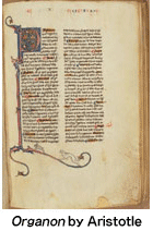
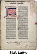
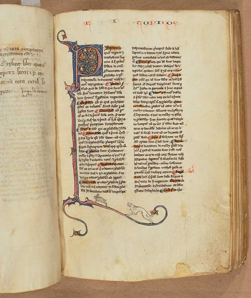
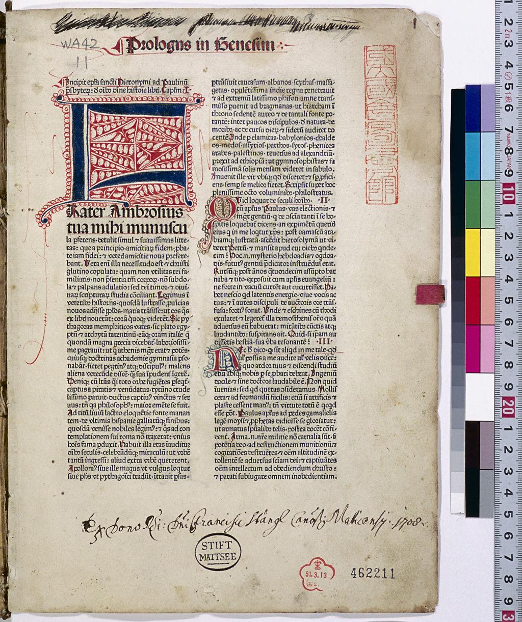
Shown on the left-hand side is Aristotle's Organon, De anima, one of the medieval manuscripts owned by the NDL. It is believed to have been transcribed in Paris in the 14th or early 15th century. Shown on the right below is the Biblia Latina, which was printed in Venice in 1475. The book design of Organon is quite similar to that of the Biblia Latina in that they both have the head titles in the margin of the page, illuminated initials, double-column layout, etc., and they are also similar in the way a blank space is left as a margin. By looking at these two items side by side, we can clearly see that incunabula took over the design of medieval manuscripts.
Easter Sunday
In the incunabula period, many of the French cities celebrated the New Year on Easter Sunday. For this reason, there were some dates with a whole year's difference in the calendars of French cities and of German cities. Since incunabula are defined as books printed in 1500 or earlier, this difference is quite important.
At the meeting of the Nicene Council held in 325, Easter Day was defined as the "Sunday that follows the first full moon after the vernal equinox." In the period of incunabula, Easter Sunday fell on the days listed in the table below. (* leap year)
| 1451 | April 25 | 1452 * | April 9 | 1453 | April 1 | 1454 | April 21 | 1455 | April 6 |
|---|---|---|---|---|---|---|---|---|---|
| 1456 * | March 28 | 1457 | April 17 | 1458 | April 2 | 1459 | March 25 | 1460 * | April 13 |
| 1461 | April 5 | 1462 | April 18 | 1463 | April 10 | 1464 * | April 1 | 1465 | April 14 |
| 1466 | April 6 | 1467 | March 29 | 1468 * | April 17 | 1469 | April 2 | 1470 | April 22 |
| 1471 | April 14 | 1472 * | March 29 | 1473 | April 18 | 1474 | April 10 | 1475 | March 26 |
| 1476 * | April 14 | 1477 | April 6 | 1478 | March 22 | 1479 | April 11 | 1480 * | April 2 |
| 1481 | April 22 | 1482 | April 7 | 1483 | March 30 | 1484 * | April 18 | 1485 | April 3 |
| 1486 | March 26 | 1487 | April 15 | 1488 * | April 6 | 1489 | April 19 | 1490 | April 11 |
| 1491 | April 3 | 1492 * | April 22 | 1493 | April 7 | 1494 | March 30 | 1495 | April 19 |
| 1496 * | April 3 | 1497 | March 26 | 1498 | April 15 | 1499 | March 31 | 1500 * | April 19 |
| 1501 | April 11 |
Format
Incunabula are made of quires which were produced by folding whole sheets of paper several times. Thus the size of an incunabulum is determined according to how large the whole sheets of paper were and how many times they were folded. A whole sheet of paper folded once is called "folio (2o)," twice "quarto (4o)," three times "octavo (8o)" and four times "sexto-decimo; (16o)." These terms are used to refer to the format of incunabula.
The size of the four typical sheets of paper used most and the sizes of the formats of the incunabula created by folding these sheets of paper are shown in the table below.
| Whole sheet of paper | Folio | Quarto | Octavo | Sexto decimo | |
|---|---|---|---|---|---|
| Imperialle | 500 x 740 | 500 x 370 | 370 x 250 | 250 x 185 | 185 x 125 |
| Realle | 445 x 616 | 445 x 308 | 308 x 223 | 223 x 154 | 154 x 112 |
| Meçane | 345 x 516 | 345 x 258 | 258 x 173 | 173 x 129 | 129 x 87 |
| Reçute | 315 x 450 | 315 x 225 | 225 x 158 | 158 x 113 | 113 x 79 |
In the bookbinding process, the quires' edges are usually trimmed straight, so the actual sizes of the books are often smaller than the figures shown above.
Gesamtkatalog der Wiegendrucke (GW)
Studies of incunabula began in the 17th century. M. Maittaire (1667-1747) and G.W. Panzer (1729-1805) chronologically arranged printed material in annals format, and in the first half of the 19th century, L. Hain published a catalog of incunabula in which all items were arranged in alphabetical order by author. In Hain's catalog, however, many of the places and dates of printing, and names of printers, were left as unknown. In the second half of the 19th century, researchers began identifying the names of the printers by comparing the typefaces. Using this method, many European nations launched projects to compile catalogs of incunabula. Germany, in particular, aspired to publish the most exhaustive union catalog of incunabula.
K. Dziatzko (1842-1903), who led this project in Germany, announced his plan in 1901 and an editorial commission (Kommision für den Gesamtkatalog der Wiegendrucke) was established in 1904 to compile a comprehensive union catalog of incunabula. K. Haebler (1857-1946), who played a central role in the commission, collected data on 145,000 incunabula owned by 676 organizations in Germany over a period of 11 years from 1906. One of the objectives of the GW was to find out where the world's incunabula exist, and surveys of incunabula outside Germany were carried out. In 1914, a catalog of broadsides was published first. Haebler also compiled the Typenrepertorium der Wiegendrucke (1905-24), a tool for identifying the type used in incunabula, and as a byproduct of this compilation work, he published three different collections of incunabula leaves (1927-28).
GW is a huge catalog of incunabula comprising 27 volumes, the first of which was published in Leipzig in 1925. Volumes 1 through 7 and the first fascicle of Volume 8 were published by 1940, but then publication was interrupted by the war. Volume 8 was completed in 1978, and Volumes 9 and 10 were published in 1991 and 2000. Currently, the eleventh volume is being published in parts. Since 2003, the Internet version of GW has been open to the public.
Gothic Type
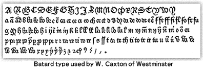
Gothic is one of the two major scripts in the Roman alphabet and was widely used in medieval manuscripts. In the 12th century, when universities were established and the volume of transcribed manuscripts grew, a style of handwriting that we now call "Protogothic" came into use. The most distinctive feature of this style is that it is narrower in width than the preceding Carolingian script and has somewhat sharp corners. From this script emerged the following scripts: "Textura," which was used chiefly for Bibles and liturgies; "Rotunda," which was a little more round; and "Batard," which was smoother, like cursive handwriting. These styles of writing came down to the period of incunabula, giving rise to the Gothic type shown below.
The word Gothic, ("like the Goths"), originated from the fact that Renaissance-period humanists considered the Gothic style rougher than the old Roman style and referred to the former as being "gothic."
Hand Press (Druckpresse)
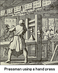
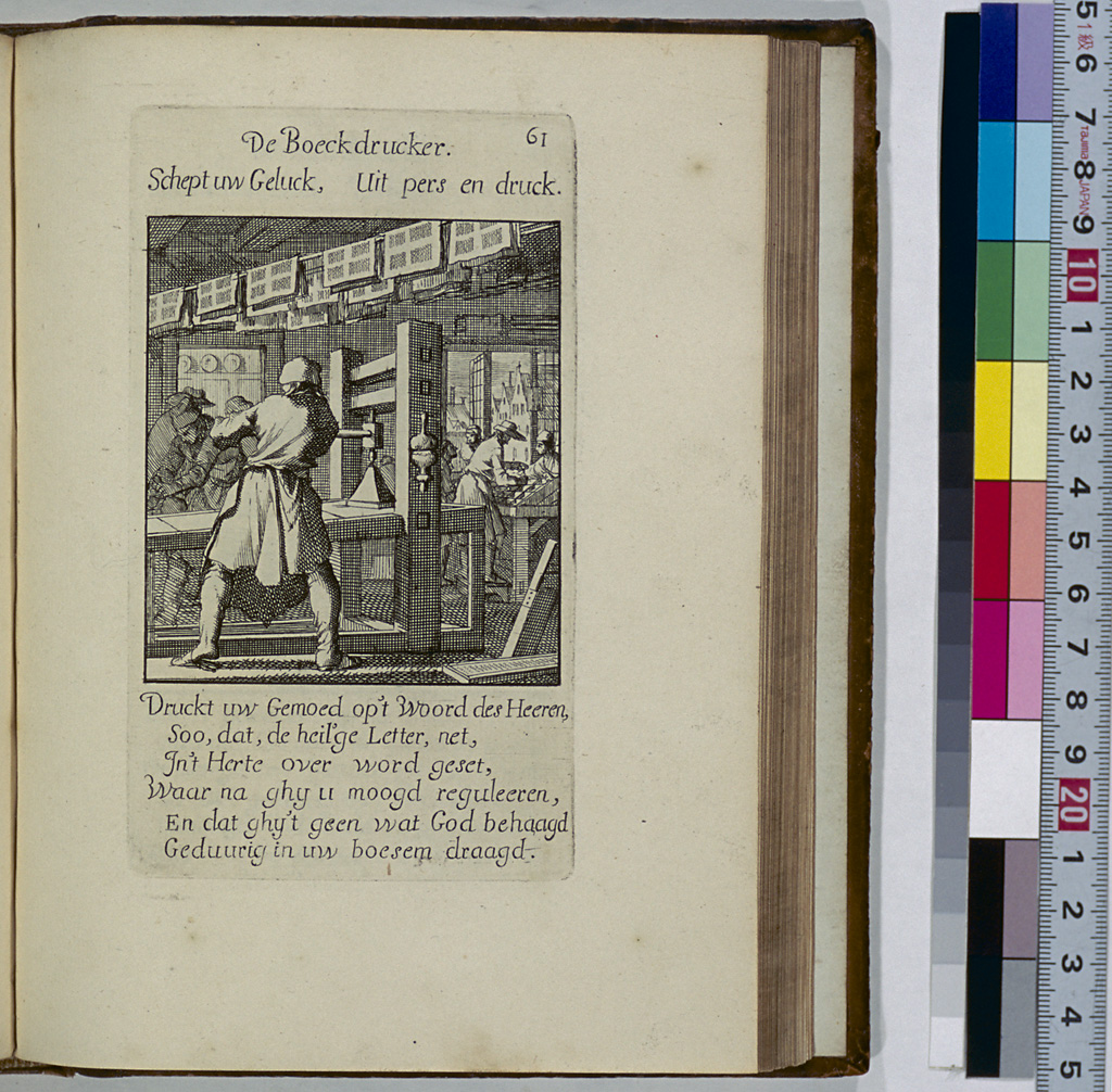
It is a common knowledge that Gutenberg's printing machine was an improved version of the wine press. The printing machines that he actually used no longer exist, but it is believed that their structure was almost the same as that of a printing machine currently preserved at the Plantin-Moretus Museum in Antwerp. It is also believed that Christian books and documents were printed by Jesuits in Japan using this model of machine; however, the only thing known for sure is that it was taken to Macau in 1614, and that the printing machine itself has been lost.
This model of printing machine, called a "hand press," is designed so that when the operating handle is horizontally pulled by hand, vertical force is applied to the forme through the screws. For details of the hand press, see Chapter 1. Books printed by a hand press are called "hand press books," and it is said that the hand press was used from the incunabula period to around 1830. Research libraries in Europe joined to form the Consortium of European Research Libraries (CERL), and this organization is currently developing a hand-press-book database. So far, data on over one million hand press books have been entered into the database, which also contains data from the Incunabula Short-Title Catalogue (ISTC) database.
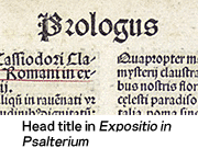
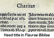
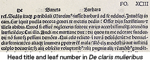
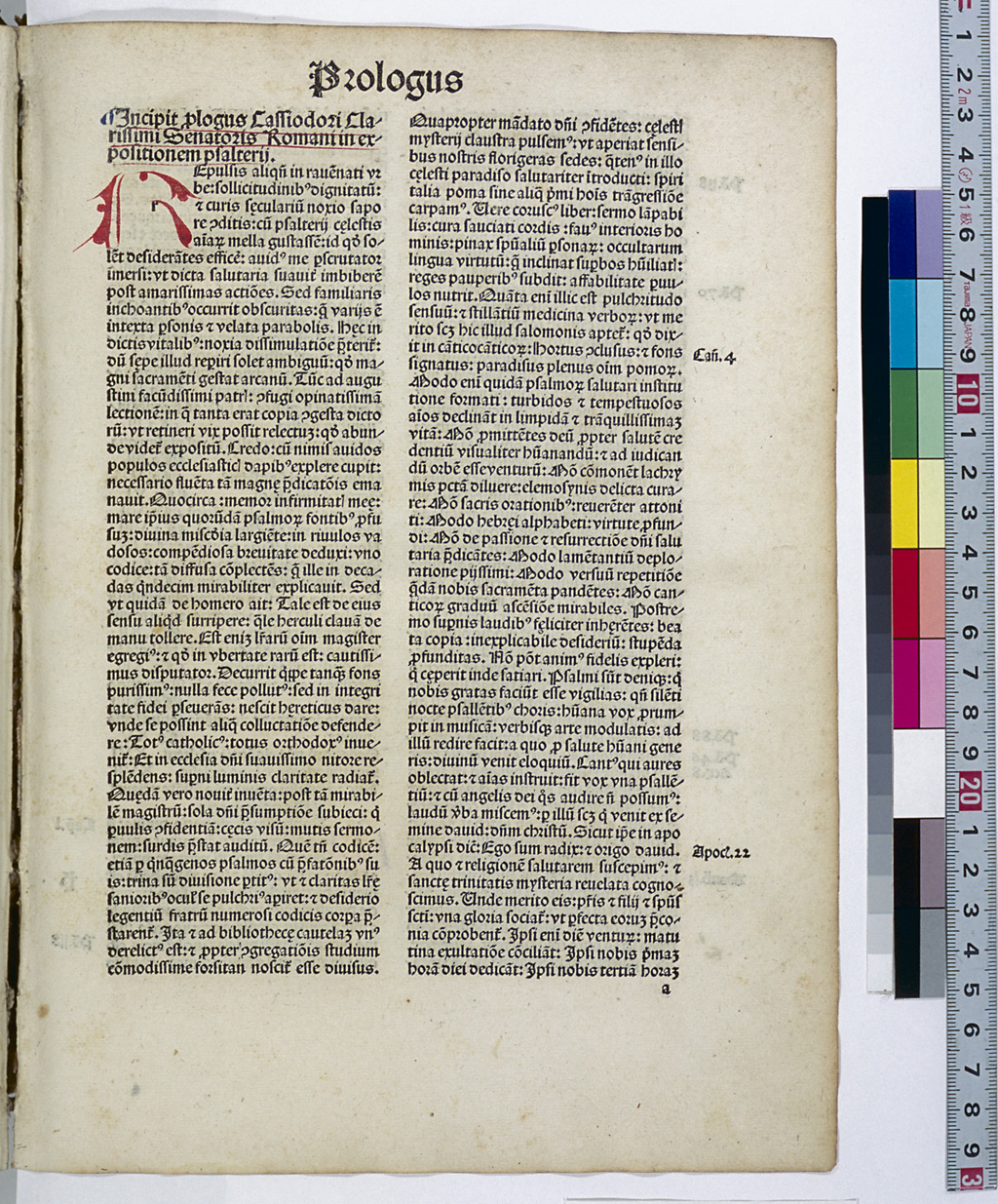
Head Title
The use of headers was adopted during the period of manuscripts and they were often written using red and blue ink alternately. In the upper margin, the title of the book or the chapter, the subject of the page or the leaf number was written. Following this practice, the printers of incunabula also printed information such as the title of the book or the chapter in the upper margin. These are called the "head title."
Incipit and Explicit
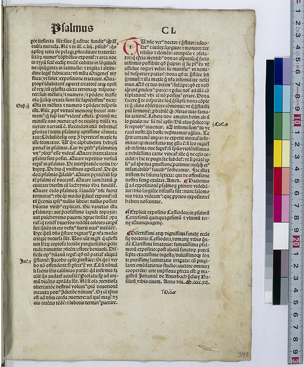
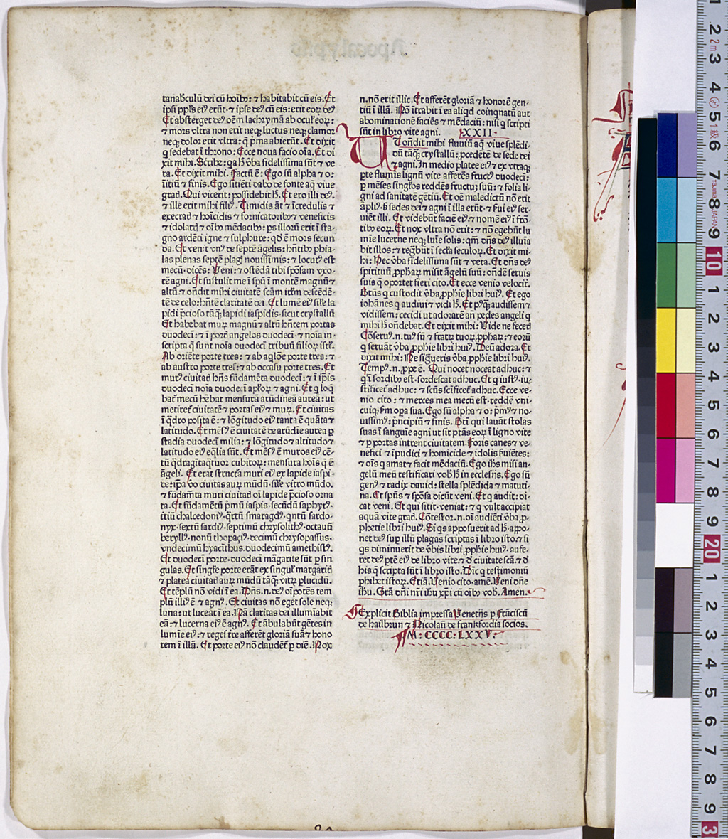
This also serves as a colophon.
Medieval Latin manuscripts began with the Latin word "incipit," which translates into "Here begins ... " in English. This first sentence is referred to as the "incipit." Usually, the word "incipit" was followed by the title of the work and information on the author. Each chapter also often started with the word "incipit."
At the end of each chapter appeared a sentence starting with the word "explicit" ("Here ends ... " in English). This sentence is referred to as the "explicit". As "incipit" and "explicit" are independent from the text, they are sometimes printed in red.
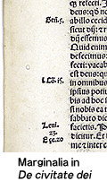
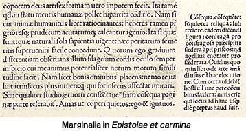
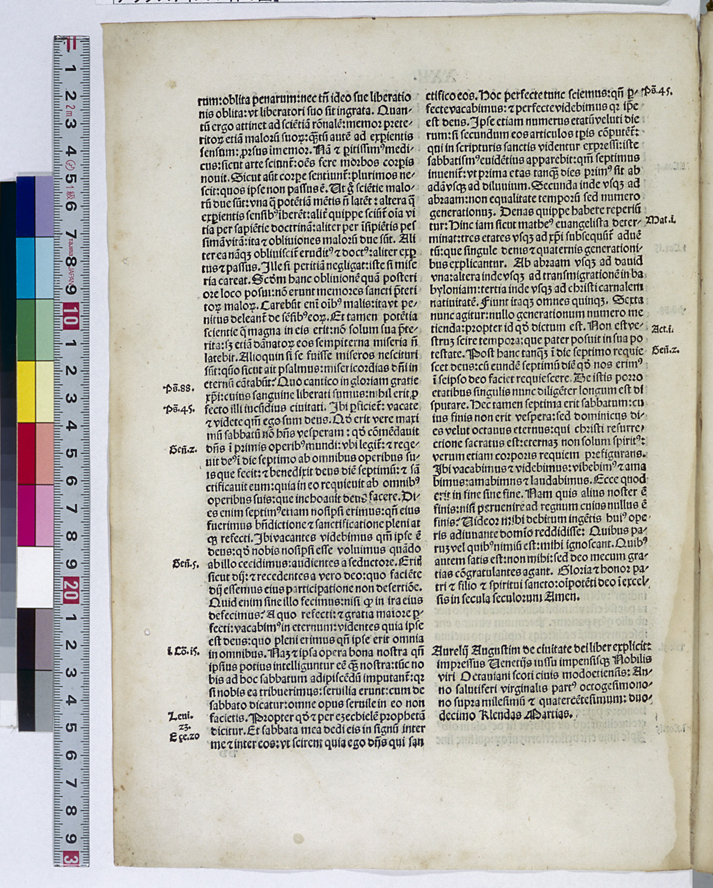
Marginalia
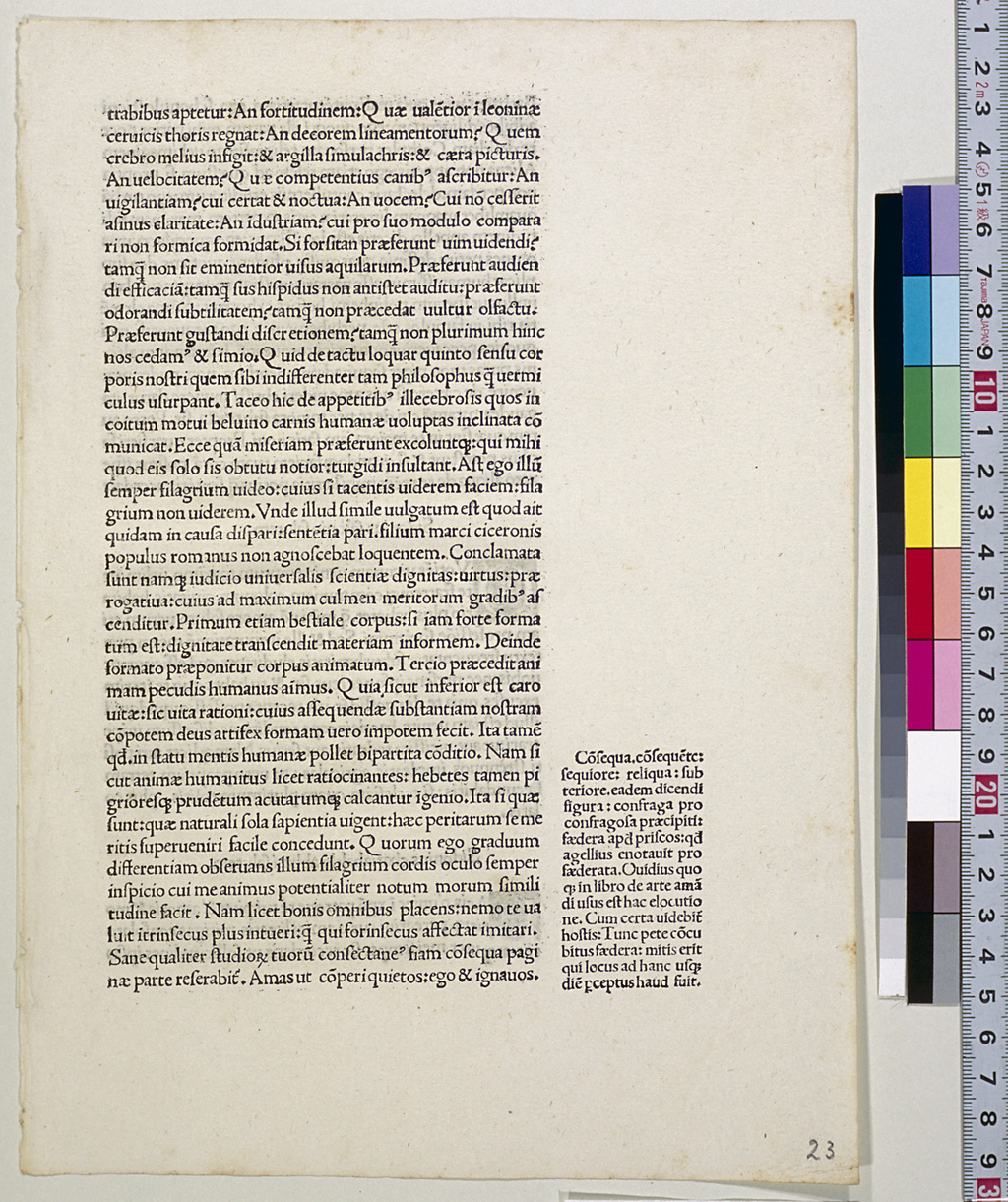
Short notes were inserted into the margins of text pages and are called "marginalia." They were used to provide information such as the source of quoted sentences and were usually printed in smaller size types than those used for the main text.
Papyrus
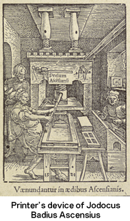
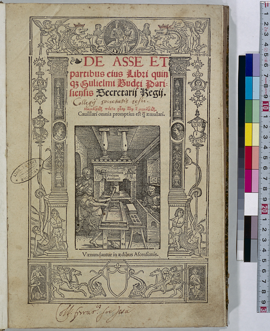
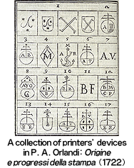
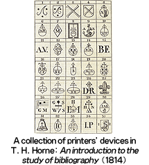
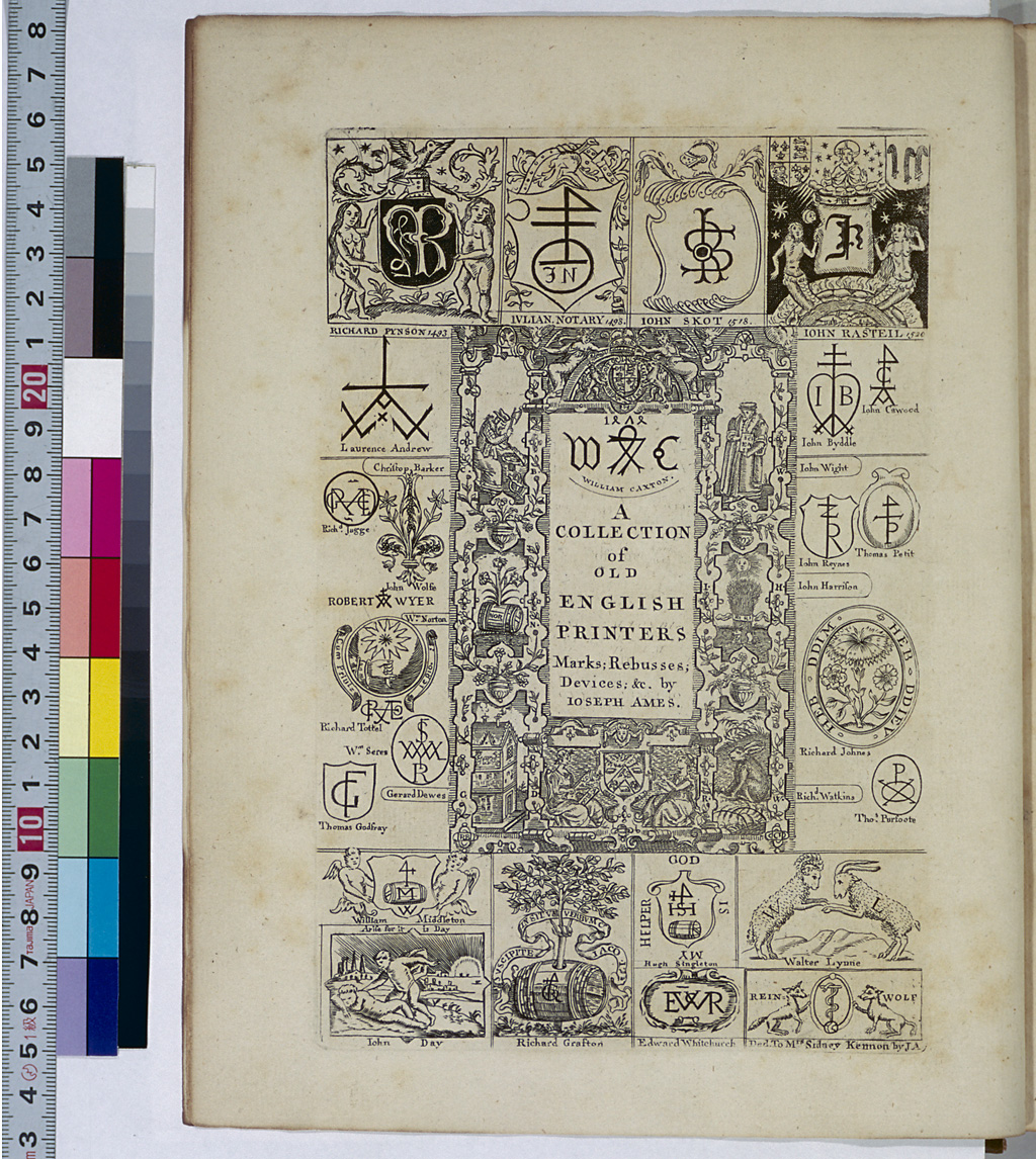
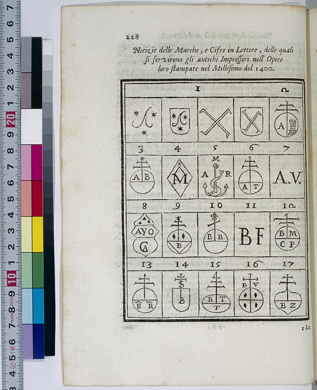
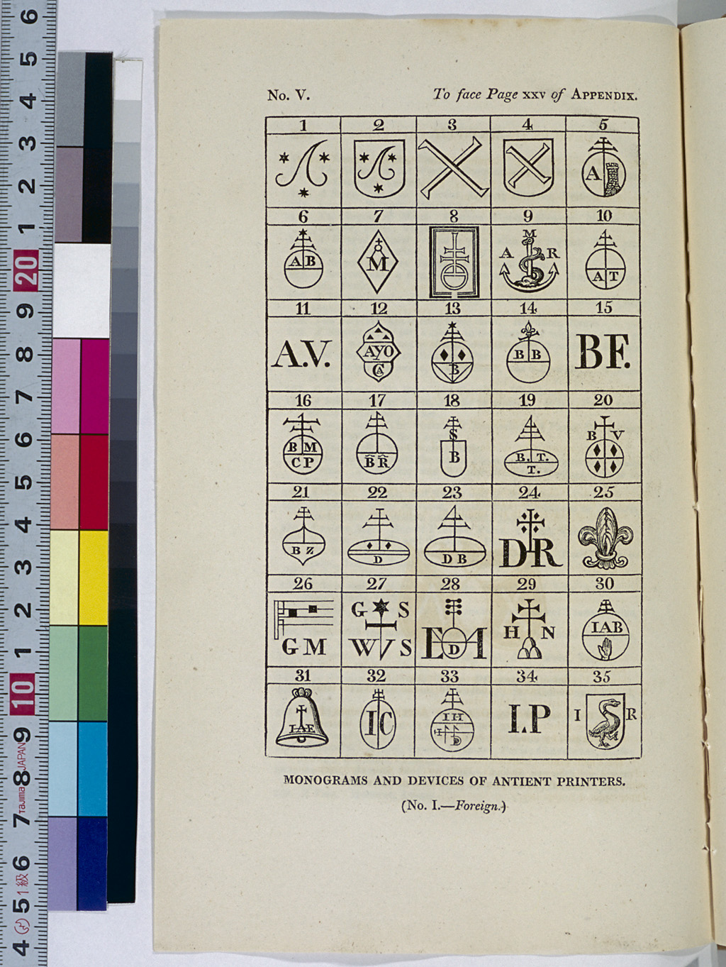
Printer's Device (Signet)
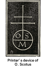
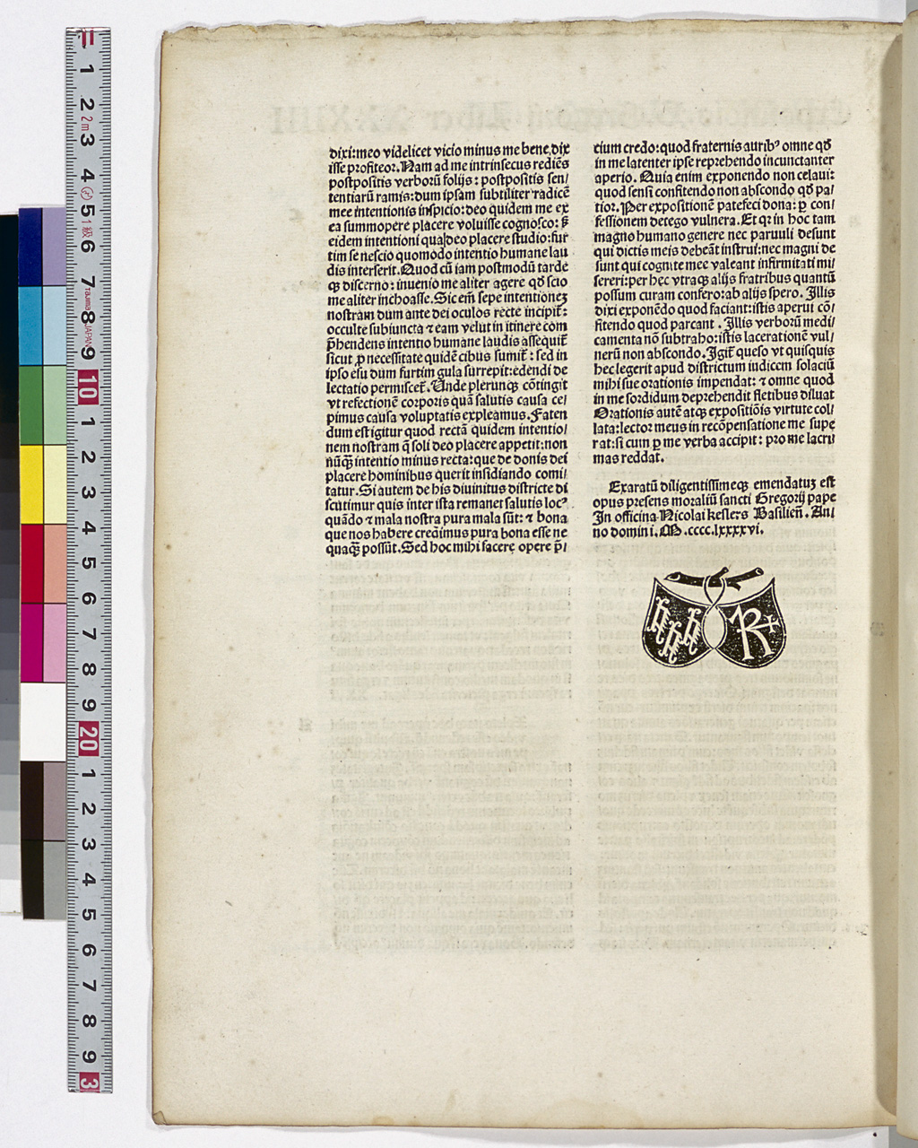
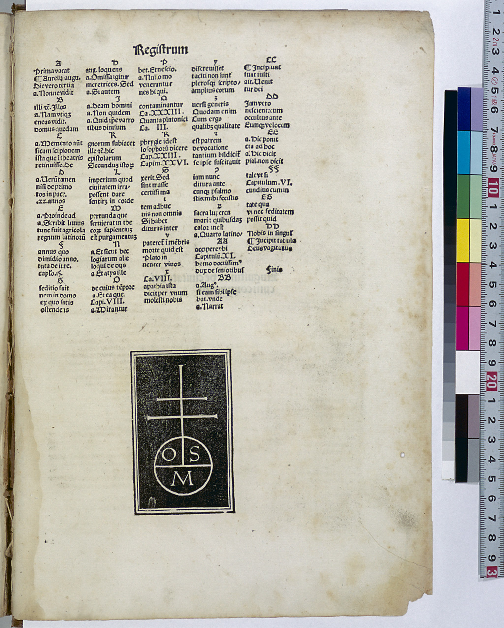
Printers often put a specific woodcut ornamental design on the title page or the last page of the books they printed. This design was used as the trademark of their printing house, and is called the "printer's device." Fust and Schöffer were the first to use a printer's device, which appears in their Biblia Latina (1462) as twin shields hanging from a tree branch. This design became a model for the other printers' devices such as that of U. Han of Rome and N. Kesler of Basel. The successors of N. Jenson of Venice used a different form of printer's device consisting of a circle and straight lines arranged in a rectangle.
Bibliographers started collecting and recording printers' devices in the 18th century. In the 19th century, M.L. Polain and L.-C. Silvestre published a collection of them. In his Typenrepertorium der Wiegendrucke (1905-24), K. Haebler, a German incunabula scholar, described the printer's devices used by each printer. In Der Bilderschmuck der Frühdrucke (1920-43), A. Schramm reproduced almost all of the German printers' devices.
In the early 16th century, prominent publishers such as Aldus, Froben, Giunta and Plantin began to use unique printer's devices, prompting the creation of various designs. Edit16, a database of books published in Italy in the 16th century, includes more than 1,000 printers' devices, making it possible to search for data on printers' devices used in this period.
Punch and Matrix
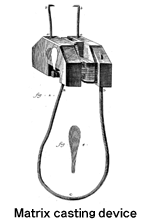
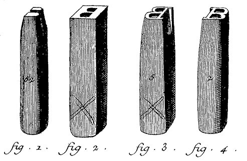
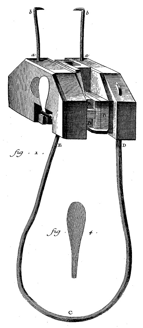
The movable metal type invented by Gutenberg was very innovative in that multiple pieces of the same type were produced. According to one record, Gutenberg acquired coin-minting techniques and worked as a mirror manufacturer in Strassburg around 1439. Since he had metal carving skills, it is believed that he was able to carve letters into hard metal to make punches, the base of type. Using these punches, pieces of type of the same shape were produced through the process of developing matrices and casting the type by surrounding the matrices with L-shaped blocks. Matrices were concave moulds created by knocking an iron punch into a piece of copper. Melted alloys consisting of lead and other kinds of metal were poured into these matrices and cooled down to produce the pieces of type. The matrix casting device shown to the left was developed to ensure smooth production.
Quire (Lage)
The form of books changed from a scroll to a codex in the second half of the 4th century. A codex was produced by piling up and stitching together several small booklets. Four sheets of animal skin or paper, laid one on top of another, are folded along the center line to produce an 8-leaf, 16-page booklet. This booklet is called a "quaternion," or a "quaer" or "quair" for short. This was the basic unit for bookbinding in the medieval period and is called a "quire" in English. Quires did not always have 8 leaves.
When book printing first began, large sheets of paper were folded several times to produce quires. To give instructions to the bookbinders on the order of how each quire should be laid on top of another, symbols such as A1 and A2 were printed on the lower right corner of the leaves that comprised the first half of the quires. These symbols are called the "signature (Signatur)."
For details, see Chapter 3.
Register
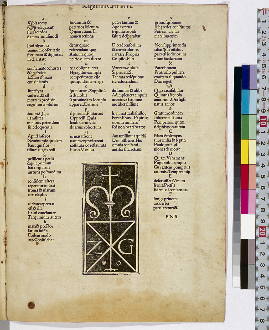
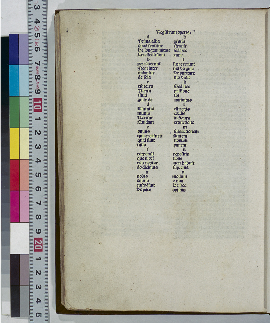
Bookbinders bound books by putting together quires according to the quire numbers (signatures). It was convenient to know what signatures were used in the book or to confirm that the quires were properly collated in the right order. For that purpose, they started to print a list of signatures and the initials in the leaves of the first half of the quires of each signature at the end of the book. The list was given a head title such as "Registrum cartharum" or "Registrum operis" and was called the "register."
Roman Type
Roman script is one of the two major scripts in the Roman alphabet. Roman script started and spread from Italian humanists' attempt to revive the style of handwriting used in ancient Roman inscriptions and to imitate the Carolingian style of handwriting used at the end of the 8th century. C. Sweynheym and A. Pannartz first used Roman type in 1465, and its use later spread to Germany. These Roman typefaces, however, retained a slightly Gothic flavor compared with today's Roman type. The present-day Roman type is based on the one first used by N. Jenson in 1470, which is said to be the most beautiful of all Roman typefaces.
In the 16th century, the Roman typeface called "Old Style" was widely favored, and in the 18th century, the one called "Modern" became popular.
Rubrication
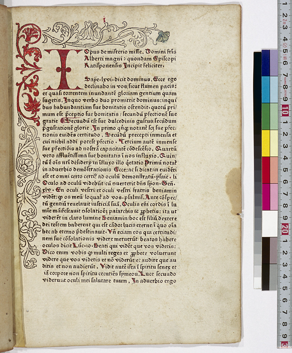
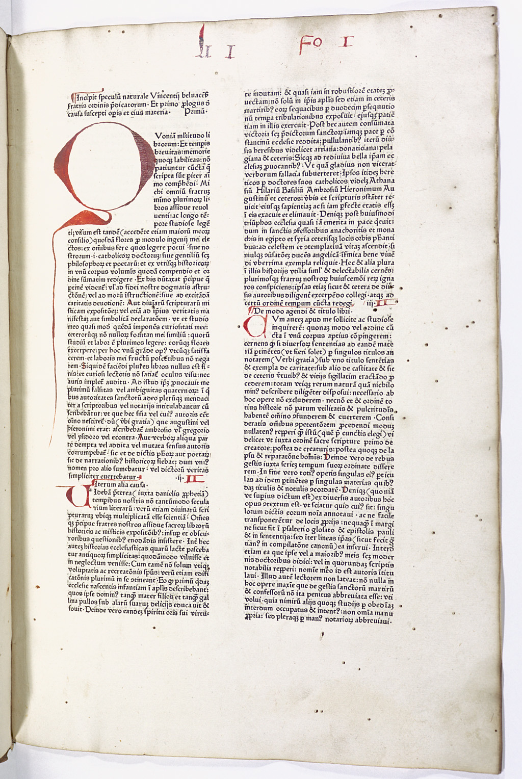
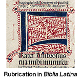
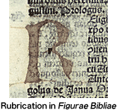
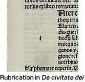
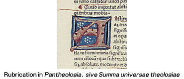
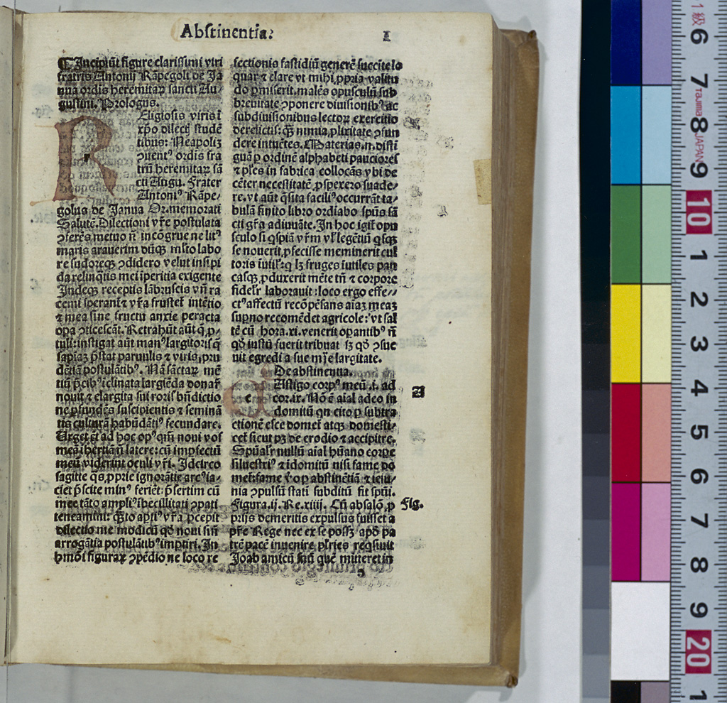
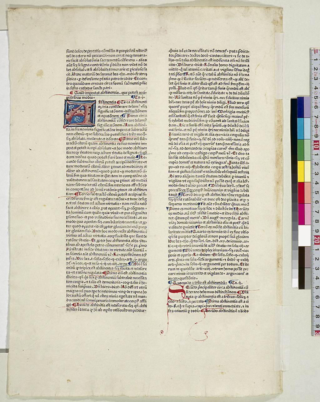
Following the design of manuscripts, printers of incunabula also had the first letter (initial) of the first word of each chapter in large size and in red ink. In the process of printing, the corresponding part of the page for the initial was left blank, and later, a craftsman called a "rubricator" drew a decorative initial in that space. To designate the letter to be drawn, a small form of the letter was sometimes printed in the space beforehand. This small printed letter is called the "guide letter."
Other decorations for manuscripts include border decorations and pictorially represented initials. They are referred to as "illuminations," and were also used in incunabula.
Title Page
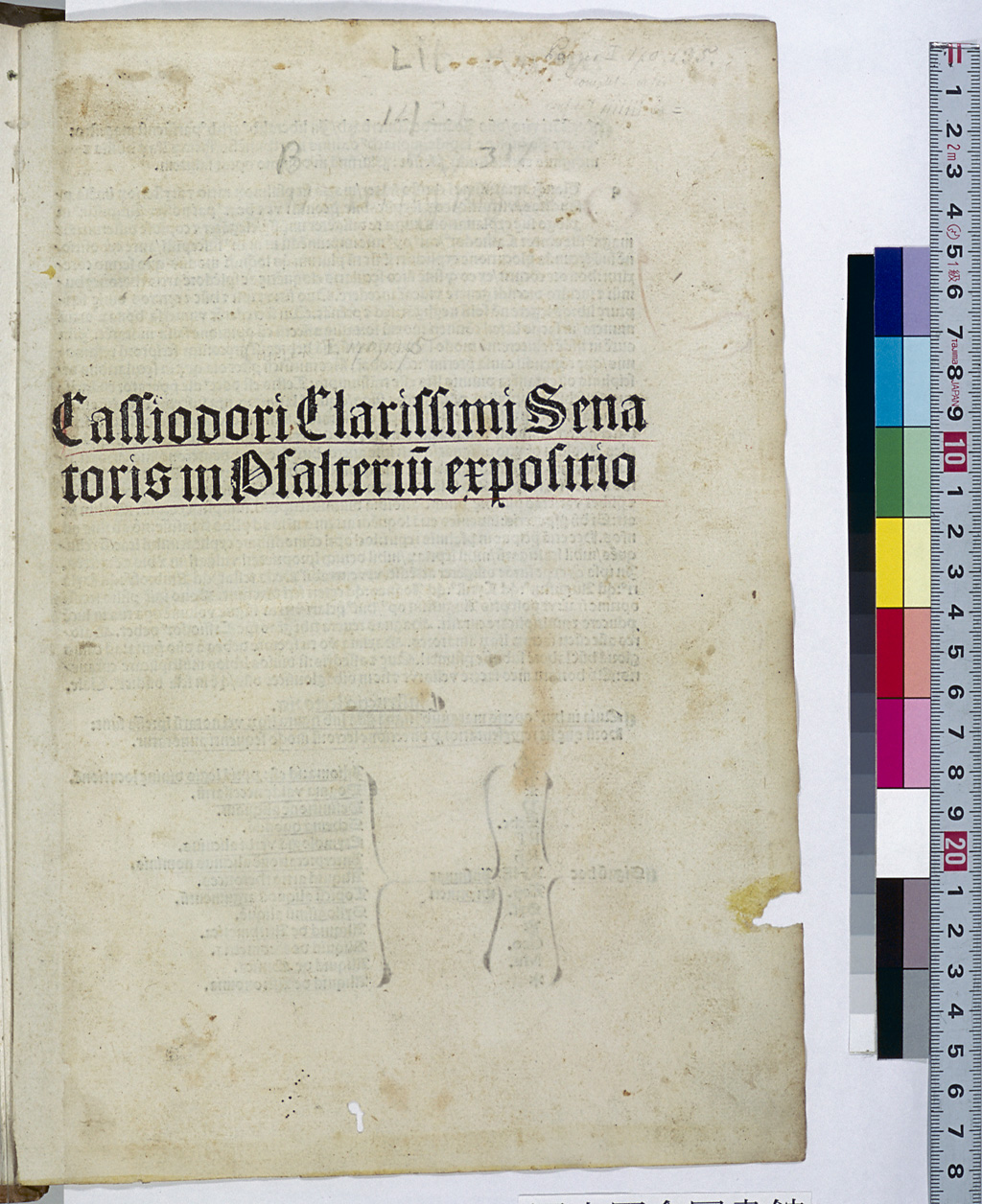
The first leaf of a book can easily become damaged or even lost. For this reason, in the second half of the 1460s, printers began to make books with the text starting on the second leaf. They left both sides or only the front side of the first leaf blank. In the early 1480s, printers began printing simple letters on the front side of the first leaf. This developed into the title page.
It was not until the early 16th century that decorated title pages including bibliographical information came into use, a format similar to today's books.
Watermark (Wasserzeichen)
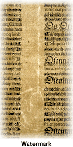
Papermaking techniques were brought to Europe in the 12th century, but the practice of placing a watermark in paper made of rags did not begin until the early 13th century. Under the assumption that watermarks were used as the paper maker's trademark, studies began in the 18th century to identify where and when the paper was produced. In the early 20th century, C. Briquet, a Swiss researcher, published a collection of watermarks entitled Les Filigranes. Today, a project to create a watermark database is under way.
For details, visit the World of Watermarks.
Woodcut Illustrations
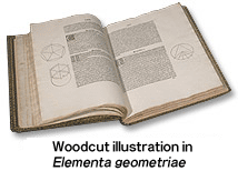
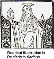
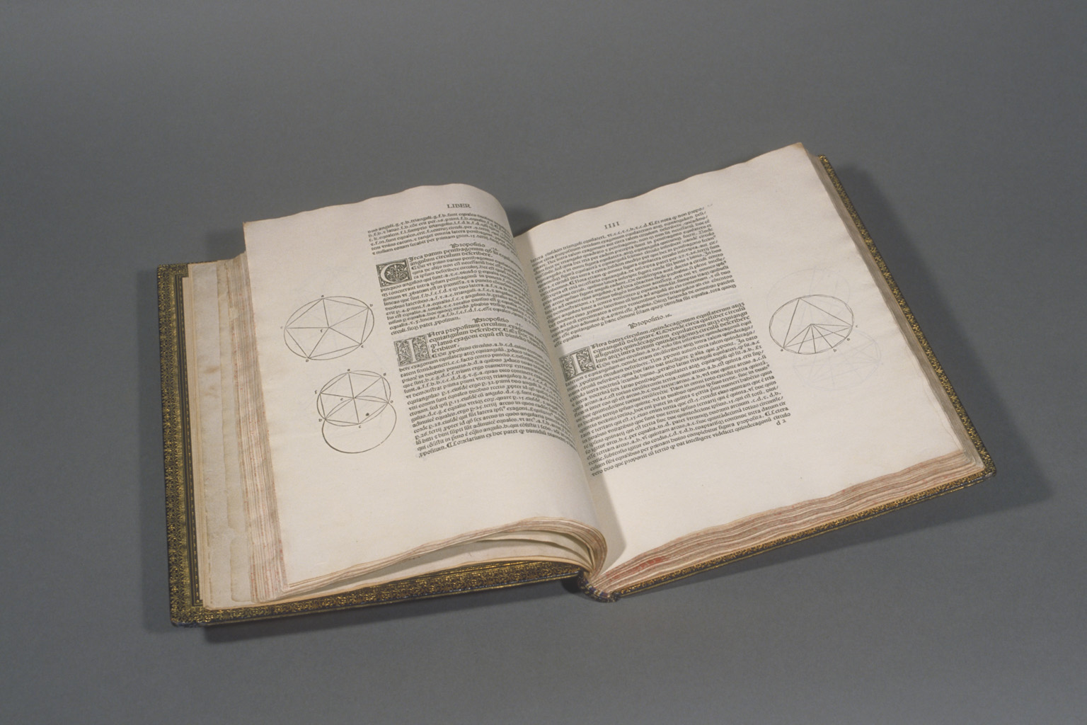
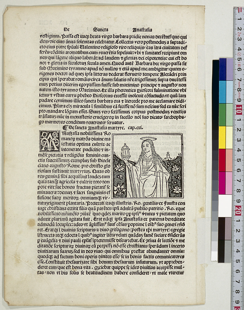
Medieval manuscripts often included illustrations. In the incunabula period, woodcuts were used for illustrations because the text pages and woodcut illustrations could be printed at the same time. The first illustrated incunabulum was Edelstein, a collection of fables printed by A. Pfister in Bamberg in 1461, and it appears that at that time, the text was printed first, followed by the illustrations. Some of the woodcut illustrations were manually colored after they were printed. In Germany, G. Zainer, J. Zainer, A. Sorg, A. Koberger and other printers produced many illustrated books. Later William Morris, a great lover of such books, printed a number of books with woodcut illustrations at the Kelmscott Press, which he founded in Hammersmith. In Italy and France as well, a large number of illustrated books were printed.
In the 16th century, illustrations were also printed using metal engraving, and in the 17th and 18th centuries, they were printed using copperplates, an intaglio method. When lithographic printing was invented in the 19th century, illustrations started being printed with this method. Some lithographic illustrations used for books on plants or birds were hand colored.
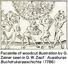
Studies on illustrated books were also conducted. In the 18th century, G.W. Zapf studied the history of printing in Augsburg, and made facsimiles of woodcut illustrations from incunabula. During the period from the late 19th century to the early 20th century, a good many research books were published including W.L. Schreiber's Manuel de l'amateur de la gravure sur bois et sur métal au XVe siècle (1891-1911), V.M. d'Essling's Les livres à figures vénitiens de la fin du XVe siècle et du commencement du XVIe (1907-14) and A. Schramm's Der Bilderschmuck der Frühdrucke (1920-43). Among these books, Der Bilderschmuck der Frühdrucke (pictorial decorations of early printing) presents an exhaustive reproduction of woodcut illustrations (including border decorations, woodcut initials and printer's devices) used in German incunabula and contains over 10,000 woodcut illustrations in its 23 volumes.
Woodcut Initial
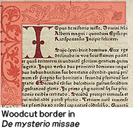
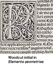
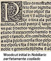
Decorative initials surrounded by arabesque patterns were not always rubricated but sometimes printed directly using woodcuts. The beautiful woodcut initials used by Johann Zainer of Ulm and Erhard Ratdolt of Venice are well known. In the 16th century, decorative initials started being printed using copper engraving.










![Woodcut initial in "Biblia [German]"](images/gfx/165/0007_t_c1.gif)
![Woodcut initial in "Biblia [German]"](../../large_images/0007_l.jpg)
