Chapter 2
Various Typefaces
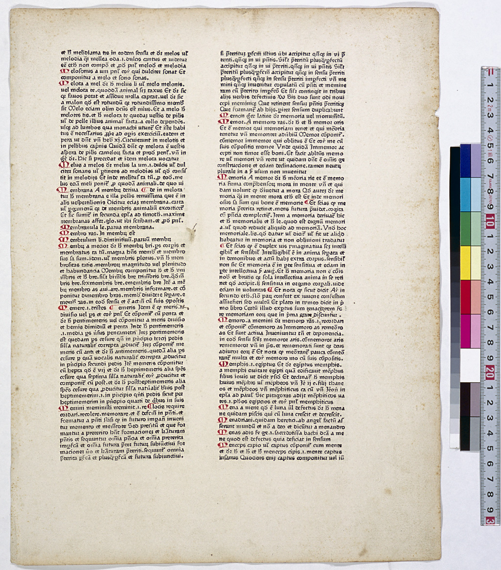
A distinctive feature of incunabula is that the typefaces used are rich in variety. Incunabula started by creating something similar to medieval manuscripts. Gutenberg's 42-line Bible used a script called "textura quadrata," which had been used for bibles and liturgies of those days. Gutenberg used about 300 kinds of type to print this Bible because he created types for all the contracted or abbreviated letters, as well as for ligatures and other kinds of letters, shown in the manuscripts he used as models. Even for the same letter, he created many pieces of type, each with a slightly different design.
In medieval Europe, different scripts were used in manuscripts depending on the type of books or documents or on when and where the transcription was performed. For this reason, the printers of incunabula used various typefaces depending on the manuscript based on which they made books. In those days, there were no craftsmen specialized in type casting, so printers had to create the punches themselves or purchase them, or purchased only the matrices to cast the type themselves. As a result, each printer used different fonts, and in incunabula studies, these fonts are used as evidence for identifying the specific printer.
The script called "textura quadrata," which was used to print the 42-line Bible, is derived from the "protogothic" script, which originated in northern France around the 11th century. It was so called because the entire page looked like textured patterns and because the letters were sharp-cornered. This script became popular in Germany shortly after, and in the period of Gutenberg it was widely used for Bibles, liturgies and other books. A similar sharp-cornered yet slightly more rounded script was created in Bologna, a northern Italian city, in the 12th century, and this was called "rotunda" and also used until the 15th century. Therefore, many pieces of type based on this "rotunda" script were produced. Until these "Gothic" scripts appeared, the elegant script "Carolingian minuscule," which had been created at the end of the eighth century when Charlemagne, the founder of the Carolingian dynasty, reigned, had spread throughout Europe. This script was introduced in the process of reforms implemented by Alcuin (c.730-804), the great scholar of York. Before his reform, books and documents written in the "half-uncial" and "cursive" scripts had been so difficult to read that Alcuin instructed the scribes to use easy-to-read letters and punctuation methods when writing. Ancient Roman classics were transcribed using this script, and educational reforms were also carried out to establish a system of the seven liberal arts. Hence, this period is now called the "Carolingian Renaissance." The "Carolingian minuscule" script is closer to those used in ancient Rome than the Gothic script; therefore humanists in the 15th century attempted to revive it as a symbol of return to classical styles of ancient times. As a result the "Roman type" was born. The term "Gothic" came from the views of the Renaissance-period humanists who regarded the Gothic type as Goth (like the Goths, barbarous or uncouth) as compared to the Roman type (ancient Roman script). Gothic and Roman were two major types used for incunabula, while italic type came into use in the 16th century.
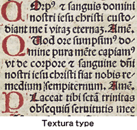
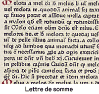
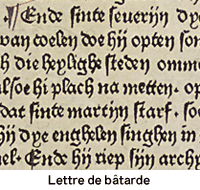
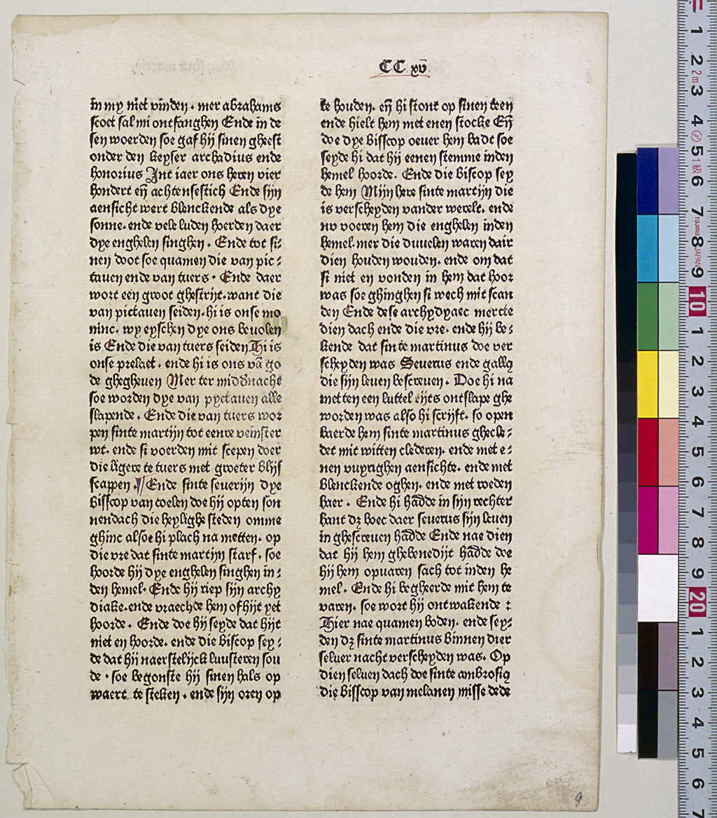
Gothic type accounts for 80% of all the types used in incunabula and can be divided into three major categories. One is the textura type used in the 42-line Bible. Also called "lettre de forme," it has sharp corners and was mainly employed for books used in churches. Another category has a roundish face and is called "lettre de somme" because the Scholastics often used it in their writings. The rotunda type, mentioned earlier, is included in this category. The script called "fere-humanistica," which Petrarch (1304-74) started to use imitating "Carolingian minuscule" is also included in this category. "Lettre de somme" was used for Balbus's Catholicon, which is attributed to Gutenberg, and also for Duranti's Rationale diüinorum officiorum, which was printed by Fust and Schöffer in 1459. The third category is cursive. This slightly slanted script was derived from the running style used for handwritten documents and is called "lettre bâtarde." It was widely used by scribes in the court of the Duchy of Burgundy, for which it is also called "lettre bourguignonne." As far as incunabula are concerned, French and English printers often used this script when they printed books and documents not in Latin but in their own language.
"Lettre bâtarde" was used for the 31-line Indulgence (1454-55), which is attributed by Gutenberg. W. Caxton, who introduced the art of printing to England, also used it most frequently of all the types. A curvilinear version of "lettre bâtarde" came into use in Germany and Switzerland around 1480 and is called "Schwabacher." In the early 16th century, this type developed into a more expressive one called "Fraktur."
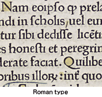
Roman type, meanwhile, accounts for 20% of all the types used in incunabula. This type arose from humanism in the Italian Renaissance, which aimed at the revival of ancient Roman cultural styles. For manuscripts by humanists, the script "antiqua," which Poggio Bracciolini (1380-1459), Niccolò Niccoli (d.1436) and Coluccio Salutati (1331-1406) had created in the early 15th century by further developing the "fere-humanistica" script used by Petrarch, was used chiefly in Florence. In the middle of the 15th century, a script imitating the uppercase-letters used for inscriptions on ancient Roman monuments came into use, which eventually developed into the Roman type.
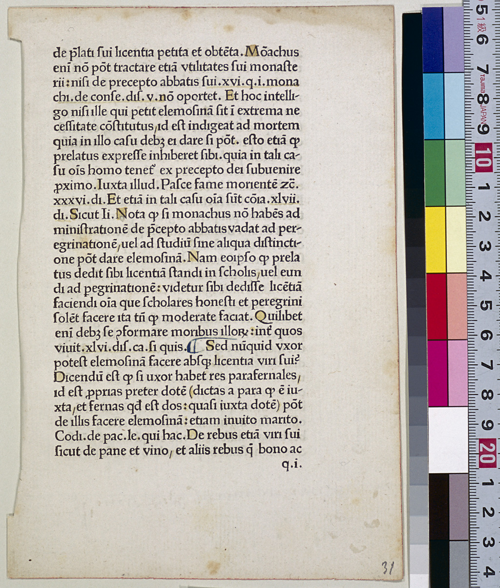
Roman type was first used by two Germans, C. Sweynheym and A. Pannartz, when they printed Cicero's De oratore in Subiaco, a village in the suburbs of Rome, in 1465. Since the type used at that time still retained a Gothic flavor, it is also called "gotico-antiqua." These two men moved to Rome in 1467 and continued to print using a different version of the Roman type, which later influenced the typefaces developed by Adolf Rusch of Strassburg and others.
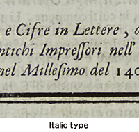
The type which is similar to today's Roman type was first designed by two brothers, Johannes and Vindelinus de Spira of Venice, who obtained the five-year sole right to use it in 1469. However, first Johannes and then Vindelinus died the following year, and a different version was created based on their type, i.e. "N. Jenson's typeface." This type, also called "Venetian," is renowned for its beautiful face, and thus became the model for the subsequent Italian typefaces. In 1496, Aldus Manutius of Venice printed P. Bembo's De Aetna dialogues using a new Roman typeface which had a stronger contrast between its lines than the Venetian type. This kind of type was named "old face," and came into wide use in the 16th century. The typeface designed by C. Garamond (c.1500-61) was used by many famous printers, including R. Estienne and C. Plantin. At the beginning of the 18th century, G. Bodoni (1740-1813), F.A. Didot (1730-1804) and others refined the design of Roman type, which was named "modern face." In the early 16th century, the above-mentioned Aldus Manutius published a series of Roman classics and other works in Octavo in which he used the slanted typeface similar to the cursive script used in manuscripts. This typeface has come to be called "italic" type.
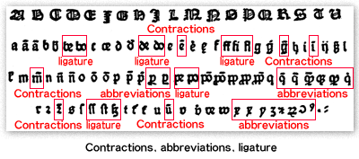
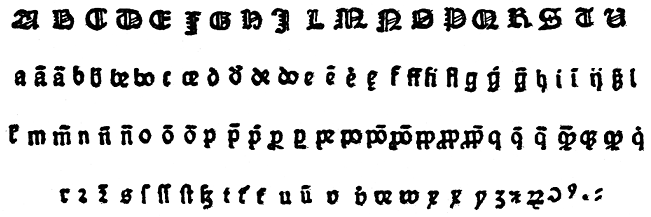
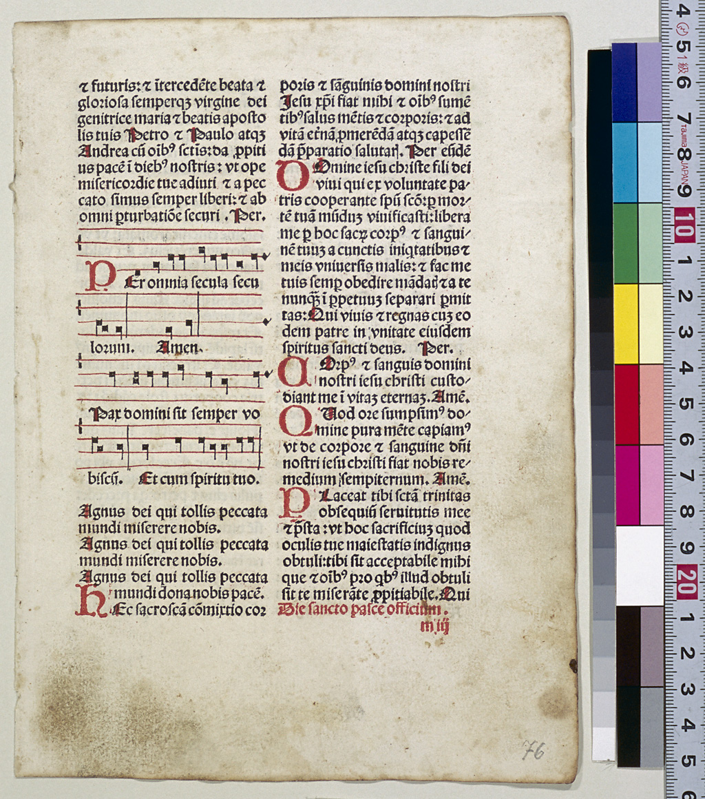
In those days the Gothic and Roman typefaces included not only regular alphabet letters and numbers but also other symbols and their combinations (called "ligatures") or letters with such symbols as "-," "~," or "º" attached. There types were made because they imitated the notation of the manuscript as it was, and the handwriting practice of using contractions and abbreviations of letters to save space and time was also maintained. For more information on the contractions and abbreviations, please refer to the Glosarry.
